Asp.Net Core API Backend ve Xamarin.Forms İle Kelime Oyunu Bölüm 4 (Game Component – Custom Grid – Android Grid View – Circle Progress Bar)
Selamlar,
Son bir kaç yazıdır Xamarin.Forms ile geliştirdiğimiz kelime oyunun dan ve kullandığımız teknolojilerden bahsetmiştim.Şimdi de oyun ekranından bahsetmek üzere karşınızdayım.
Burada oyun componenti için custom renderer yazarken nelerle karşılaştık ne şekilde aştık bunlardan bahsetmek istiyorum.
Önce oyun ekranını bir hatırlayalım

Burada iki adet custom component mevcut.
- Custom Circle Progress Bar (Zaman geri sayacı olarak kullandığımız)
- Custom Grid
Önce Circle ProgressBar dan bahsedeyim.
public class CircleProgressBar : BoxView
    {
        public readonly BindableProperty BackColorProperty = BindableProperty.Create(nameof(BackColor), typeof(Color), typeof(CircleProgressBar), Color.Transparent);
        public readonly BindableProperty ForeColorProperty = BindableProperty.Create(nameof(ForeColor), typeof(Color), typeof(CircleProgressBar), Color.Transparent);
        public readonly BindableProperty BarHeightProperty = BindableProperty.Create(nameof(BarHeight), typeof(double), typeof(CircleProgressBar), default(double));
        public readonly BindableProperty MinimunProperty = BindableProperty.Create(nameof(Minimun), typeof(int), typeof(CircleProgressBar), default(int));
        public readonly BindableProperty MaximunProperty = BindableProperty.Create(nameof(Maximun), typeof(int), typeof(CircleProgressBar), default(int),propertyChanged: (b, o, n) =>
        {
            var bar = (CircleProgressBar)b;
            bar.Maximun = (int)n;
        });
        public readonly BindableProperty ValueProperty = BindableProperty.Create(nameof(Value), typeof(int), typeof(CircleProgressBar), default(int),
            BindingMode.TwoWay,
               (BindableProperty.ValidateValueDelegate)null,
               (obj, oldValue, newValue) => {
                   var bar = obj as CircleProgressBar;
                   if (bar.BindingContext is MainPageViewModel context)
                   {
                       bar.Value = context.RemainingTime;
                   }
               },
               (BindableProperty.BindingPropertyChangingDelegate)null,
               (BindableProperty.CoerceValueDelegate)null,
               (BindableProperty.CreateDefaultValueDelegate)null);

        public readonly BindableProperty AnimationDurationProperty = BindableProperty.Create(nameof(AnimationDuration), typeof(int), typeof(CircleProgressBar), default(int));
        public readonly BindableProperty TextSizeProperty = BindableProperty.Create(nameof(TextSize), typeof(int), typeof(CircleProgressBar), default(int));
        public readonly BindableProperty TextMarginProperty = BindableProperty.Create(nameof(TextMargin), typeof(int), typeof(CircleProgressBar), default(int));
        public readonly BindableProperty TextProperty = BindableProperty.Create(nameof(Text), typeof(string), typeof(CircleProgressBar), string.Empty, propertyChanged: (b, o, n) =>
        {
            var bar = (CircleProgressBar)b;
            if (bar.BindingContext is MainPageViewModel context)
            {
                bar.Text = context.RemainingTime.ToString();
            }
        });
        public readonly BindableProperty TextColorProperty = BindableProperty.Create(nameof(TextColor), typeof(Color), typeof(CircleProgressBar), Color.Black);

        public CircleProgressBar()
        {
        }

        public Color BackColor
        {
            get { return (Color)GetValue(BackColorProperty); }
            set { SetValue(BackColorProperty, value); }
        }

        public Color ForeColor
        {
            get { return (Color)GetValue(ForeColorProperty); }
            set { SetValue(ForeColorProperty, value); }
        }

        public double BarHeight
        {
            get { return (double)GetValue(BarHeightProperty); }
            set { SetValue(BarHeightProperty, value); }
        }

        public int Minimun
        {
            get { return (int)GetValue(MinimunProperty); }
            set { SetValue(MinimunProperty, value); }
        }

        public int Maximun
        {
            get { return (int)GetValue(MaximunProperty); }
            set { SetValue(MaximunProperty, value); }
        }

        public int Value
        {
            get { return (int)GetValue(ValueProperty); }
            set { SetValue(ValueProperty, value); }
        }

        public int AnimationDuration
        {
            get { return (int)GetValue(AnimationDurationProperty); }
            set { SetValue(AnimationDurationProperty, value); }
        }

        public int TextSize
        {
            get { return (int)GetValue(TextSizeProperty); }
            set { SetValue(TextSizeProperty, value); }
        }

        public int TextMargin
        {
            get { return (int)GetValue(TextMarginProperty); }
            set { SetValue(TextMarginProperty, value); }
        }

        public string Text
        {
            get { return GetValue(TextProperty).ToString(); }
            set { SetValue(TextProperty, value); }
        }

        public Color TextColor
        {
            get { return (Color)GetValue(TextColorProperty); }
            set { SetValue(TextColorProperty, value); }
        }
    }
Burada göreceğiniz gibi aslında circular progress bar oluşturmak için BoxView dan miras aldık. Gerekli bir kaç property i bindable olarak tanımladıktan sonra platforms spesifik taraflara geçip Custom Renderer larımızı yazmaya başladık
Aşağıda iOS Custom Renderer kodlarını görüyorsunuz.
BoxView ios tarafından temel de UIView kullandığı için ister BoxRenderer dan isterseniz VisualElementRenderer dan miras alarak custom renderer a başlayabilirsiniz.BoxRenderer da en nihayetinde VisualElementRenderer dan miras alıyor zaten.
[assembly: ExportRenderer(typeof(CircleProgressBar), typeof(CircleProgressBarRenderer))]
namespace...iOS.CustomRenderers
{
    public class CircleProgressBarRenderer : VisualElementRenderer
    {
        CAShapeLayer backgroundCircle;
        CAShapeLayer indicatorCircle;
        UILabel indicatorLabel;
        CGSize indicatorLabelSize;
        int indicatorFontSize;

        double startAngle = 1.5 * Math.PI;

        public CircleProgressBarRenderer()  { }

        protected override void OnElementChanged(ElementChangedEventArgs e)
        {
            base.OnElementChanged(e);

            if (Element != null)
            {
                indicatorFontSize = Element.TextSize;

                backgroundCircle = new CAShapeLayer();

                CreateBackgroundCircle();

                CreateIndicatorCircle();

                CreateIndicatorLabel();
            }
        }

        protected override void OnElementPropertyChanged(object sender, PropertyChangedEventArgs e)
        {
            base.OnElementPropertyChanged(sender, e);

            if (e.PropertyName == "Text")
            {
                if (Element.BindingContext is MainPageViewModel model)
                {
                    indicatorLabel.Text = model.RemainingTime.ToString();
                    var val = CalculateValue();
                    animateBackwards(val);
                }
            }
        }

        public override void LayoutSubviews()
        {
            base.LayoutSubviews();

            double radius = CreatePathAndReturnRadius();

            double heightRatio = (radius - Element.TextMargin) / indicatorLabelSize.Height;
            double widthRatio = (radius - Element.TextMargin) / indicatorLabelSize.Width;
            double ratio = 1;
            if (heightRatio < widthRatio)                                   ratio = (radius - Element.TextMargin) / indicatorLabelSize.Height;             else                 ratio = (radius - Element.TextMargin) / indicatorLabelSize.Width;             indicatorFontSize = (int)Math.Round(indicatorFontSize * ratio, 0, MidpointRounding.ToEven);             indicatorLabel.Font = UIFont.SystemFontOfSize(indicatorFontSize);             indicatorLabel.InvalidateIntrinsicContentSize();             indicatorLabelSize = indicatorLabel.IntrinsicContentSize;             indicatorLabel.Frame = new CGRect((Frame.Width / 2) - (indicatorLabelSize.Width / 2), (Frame.Height / 2) - (indicatorLabelSize.Height / 2), indicatorLabelSize.Width, indicatorLabelSize.Height);             this.AddSubview(indicatorLabel);             animate();         }         private double CalculateValue()         {             double min = Element.Minimun;             double max = Element.Maximun;             double current = Element.Value;             double range = max - min;             return current / range > 1 ? 1 : current / range;
        }

        private void CreateIndicatorLabel()
        {
            indicatorLabel = new UILabel();
            indicatorLabel.AdjustsFontSizeToFitWidth = true;
            indicatorLabel.Font = UIFont.SystemFontOfSize(indicatorFontSize);
            indicatorLabel.Text = Element.Text.ToString();
            indicatorLabel.TextColor = Element.TextColor.ToUIColor();
            indicatorLabel.TextAlignment = UITextAlignment.Center;
            indicatorLabelSize = indicatorLabel.IntrinsicContentSize;
        }

        private void CreateIndicatorCircle()
        {
            indicatorCircle = new CAShapeLayer();
            indicatorCircle.StrokeColor = Element.ForeColor.ToCGColor();
            indicatorCircle.FillColor = UIColor.Clear.CGColor;
            indicatorCircle.LineWidth = new nfloat(Element.BarHeight);
            indicatorCircle.Frame = this.Bounds;
            indicatorCircle.LineCap = CAShapeLayer.CapButt;
            this.Layer.AddSublayer(indicatorCircle);
        }

        private void CreateBackgroundCircle()
        {
            backgroundCircle.StrokeColor = Element.BackColor.ToCGColor();
            backgroundCircle.FillColor = UIColor.Clear.CGColor;
            backgroundCircle.LineWidth = new nfloat(Element.BarHeight);
            backgroundCircle.Frame = this.Bounds;
            this.Layer.AddSublayer(backgroundCircle);
        }

        private double CreatePathAndReturnRadius()
        {
            var radius = (Math.Min(Frame.Size.Width, Frame.Size.Height) - backgroundCircle.LineWidth - 2) / 2;
            var circlePath = new UIBezierPath();
            circlePath.AddArc(new CGPoint(Frame.Size.Width / 2, Frame.Size.Height / 2), (nfloat)radius, (nfloat)startAngle, (nfloat)(startAngle + 2 * Math.PI), true);
            backgroundCircle.Path = circlePath.CGPath;
            indicatorCircle.Path = circlePath.CGPath;
            backgroundCircle.StrokeEnd = new nfloat(1.5);
            indicatorCircle.StrokeEnd = new nfloat(1.5);//new nfloat(CalculateValue());
            return radius;
        }

        private void animate()
        {
            var animation = new CABasicAnimation();
            animation.KeyPath = "strokeEnd";
            animation.Duration = Element.AnimationDuration / 1000;
            animation.From = new NSNumber(0.0);
            animation.To = new NSNumber(CalculateValue());
            animation.TimingFunction = CAMediaTimingFunction.FromName(CAMediaTimingFunction.EaseOut);
            indicatorCircle.StrokeStart = new nfloat(0.0);
            indicatorCircle.StrokeEnd = new nfloat(CalculateValue());
            indicatorCircle.AddAnimation(animation, "appear");
        }

        private void animateBackwards(double val)
        {
            var animation = new CABasicAnimation();
            animation.KeyPath = "strokeEnd";
            animation.Duration = Element.AnimationDuration / 1000;
            animation.From = new NSNumber(val);
            animation.To = new NSNumber(val - 0.00185);
            animation.TimingFunction = CAMediaTimingFunction.FromName(CAMediaTimingFunction.EaseOut);
            indicatorCircle.StrokeStart = new nfloat(0.0);
            indicatorCircle.StrokeEnd = new nfloat(1.5);
            indicatorCircle.AddAnimation(animation, "appear");
        }
    }
}
iOS tarafında CAShapeLayer sınıfı ekranda birşeyler çizmek için kullanacak olduğunuz namespace.
Biz de ekran xamarin forms tarafında renk, font size vs gibi bazı propertyleri alarak, bir yuvarlak simit oluşturuyoruz. Tam ortasına denk gelecek şekilde hesaplayarak bir adet UILabel i simitin ortasına yerleştiriyoruz.
Sonrasında iki farklı animasyon olarak, birincisi ekran ilk açıldığında sıfırdan maksimum noktasına gelecek şekilde animate edip, daha sonra her bir saniye geçtiğinde çizilmesi gereken kısmı hesaplayıp ters yönde bir animasyon çalıştırıyoruz.
OnElementPropertyChanged olayında da hem UILabel ın text ini hem de geri şekilde yapılacak olan anismayonumuzu oynatıyoruz. OnElementPropertyChanged olayı bildiğiniz gibi bir custom renderer yazarken, forms tarafında oluşturmuş olduğunuz bindable propertylerın değerlerinin değişmesi sonucu platform spesifik taraflarda bu olayı tetikliyor. Dolayısı ile bir custom renderer yazdığınız zaman, oluşturmuş olduğunuz componentin bazı değerleri runtime içerisinde değişiyor ve buna göre aksiyonlar almanız gerekiyorsa bu event içerisinde ilgili aksiyonlarınızı tetikleyebilirsiniz.
Android tarafında da durum şöyle.
[assembly: ExportRenderer(typeof(CircleProgressBar), typeof(CircleProgressBarRenderer))]

namespace ...Droid.CustomRenderers
{
    public class CircleProgressBarRenderer : ViewRenderer<CircleProgressBar, ProgressBar>
    {
        private ProgressBar pBar;
        private Drawable pBarBackDrawable;
        private Drawable pBarForeDrawable;
        public CircleProgressBarRenderer(Context context) : base(context)
        {
            SetWillNotDraw(false);
        }

        protected override void OnElementChanged(ElementChangedEventArgs e)
        {
            base.OnElementChanged(e);
            if (Control == null)
            {
                pBar = CreateNativeControl();
                SetNativeControl(pBar);
                CreateAnimation();
            }
        }

        protected override void OnElementPropertyChanged(object sender, PropertyChangedEventArgs e)
        {
            base.OnElementPropertyChanged(sender, e);

            if (e.PropertyName == "Text")
            {
                if (Element.BindingContext is MainPageViewModel model)
                {
                    CreateAnimationCountDown(model.RemainingTime);
                    Draw(new Canvas());
                }
            }
        }

        protected override ProgressBar CreateNativeControl()
        {
            pBarBackDrawable = DrawableCompat.Wrap(Resources.GetDrawable("CircularProgress_background"));
            pBarForeDrawable = DrawableCompat.Wrap(Resources.GetDrawable("CircularProgress_drawable"));

            DrawableCompat.SetTint(pBarBackDrawable, Element.BackColor.ToAndroid());
            DrawableCompat.SetTint(pBarForeDrawable, Element.ForeColor.ToAndroid());

            var nativeControl = new ProgressBar(Context, null, Android.Resource.Attribute.ProgressBarStyleHorizontal)
            {
                Indeterminate = false,
                Max = Element.Maximun,
                ProgressDrawable = pBarForeDrawable,
                Rotation = -90f,
                LayoutParameters = new LayoutParams(LayoutParams.MatchParent, LayoutParams.MatchParent),
            };

            nativeControl.SetBackground(pBarBackDrawable);

            return nativeControl;
        }

        public override void Draw(Canvas canvas)
        {
            base.Draw(canvas);
        }

        protected override void OnDraw(Canvas canvas)
        {
            base.Invalidate();
            base.OnDraw(canvas);

            Rect bounds = new Rect();
            TextPaint paint = new TextPaint();
            paint.Color = Element.TextColor.ToAndroid();
            paint.TextSize = Element.TextSize;
            paint.GetTextBounds(Element.Text.ToString(), 0, Element.Text.ToString().Length, bounds);
            if (((this.Width / 2) - (Element.TextMargin * 4)) < bounds.Width())
            {
                float ratio = (float)((this.Width / 2) - Element.TextMargin * 4) / (float)bounds.Width();
                paint.TextSize = paint.TextSize * ratio;
                paint.GetTextBounds(Element.Text.ToString(), 0, Element.Text.ToString().Length, bounds);
            }

            int x = this.Width / 2 - bounds.CenterX();
            int y = this.Height / 2 - bounds.CenterY();
            canvas.DrawText(Element.Text.ToString(), x, y, paint);
        }

        private void CreateAnimation()
        {
            ObjectAnimator anim = ObjectAnimator.OfInt(pBar, "progress", Element.Minimun, Element.Value);
            anim.SetDuration(Element.AnimationDuration);
            anim.SetInterpolator(new DecelerateInterpolator());
            anim.Start();
        }

        private void CreateAnimationCountDown(int val)
        {
            ObjectAnimator anim = ObjectAnimator.OfInt(pBar, "progress", val, val - 1);
            anim.SetDuration(Element.AnimationDuration);
            anim.SetInterpolator(new DecelerateInterpolator());
            anim.Start();
        }
    }
}
Android tarafında ise işler kısmen daha kolay çünkü zaten bir ProgressBar widget ı var. Bu tarafta ise bu widget ın ortasına Text i basmak biraz zor oldu, OnDraw metodunu override edip tam ortaya gelecek şekilde bir canvas çizerek devam ettik.
Nihayetinde yukarıdaki resimde ki gibi, renkleri gibi bazı özellikleri ile oynayabildiğimiz ileri geri animasyonla hareke edebilen, güzel bir circle progress bar ımız olmuş oldu her iki platformda da.
Gelelim Grid View ın kendisine. Burada en çok dikkat çeken şey benim için şu oldu.
xamarin.forms.platform.ios içerisinde ki GetControl metodu ve bu metodun android tarafında olmayışı.
Çünkü ilerleyişe şu şekilde başladık;
- Xamarin.Forms tarafında normal Grid den miras alan bir component yazıp, istediğimiz ekstra özellikleri buraya ekleyelim
- Zaten harf dizilimlerini de burada yaptıktan sonra, Platform spesifik taraflara geçerek, Touch eventleri ezip ilgili harf e denk gelen o touch ile ilgili işlemlerimizi yapalım
Bu işleyiş iOS tarafında çok güzel çalıştı. Forms tarafında yaptığımız CustomGrid, içi dolu bir şekilde iOS tarafında GetControl dediğimizde elimizdeydi. Ekrandaki tüm UIView lar içerisinde dönüp istediğimiz işlemi istediğimiz şekilde yapabildik. Her şey çok güzeldi.
taa ki android tarafında ki renderer kısmına geçene kadar.
İki taraftada ViewRenderer kullanmamıza rağmen, Android tarafta nereden miras alırsak alalım, elimize Forms tarafında içini butonlarla doldurduğumuz halde bir grid gelmedi. Bir şekilde her ne denediysek, forms taraftaki içi dolu Grid e ulaşamadık.
Bu yüzden tüm GridView baştan oluşturup ekrana sıfırdan bir komponent yazıyormuş eklemek zorunda kaldık.
GridView ın forms tarafı şu şekilde.
 public class CustomGrid : Grid
    {
        public CustomGrid()
        {
            SwipedButtonList = new List();
        }

        public List SwipedButtonList { get; set; }

        public static readonly BindableProperty IsFilledProperty = BindableProperty.Create(nameof(IsFilled),
           typeof(bool),
           typeof(CustomGrid),
           false,
           BindingMode.TwoWay,
           null,
           null,
           null,
           null,
           null);


        public bool IsFilled
        {
            get { return (bool)this.GetValue(IsFilledProperty); }
            set { this.SetValue(IsFilledProperty, (object)value); }
        }


        public static readonly BindableProperty SelectWordProperty = BindableProperty.Create(nameof(BackgroundColor),
               typeof(string),
               typeof(CustomGrid),
               string.Empty,
               BindingMode.TwoWay,
               null,
               (obj, oldValue, newValue) => {
                   var old = oldValue;
                   var n = newValue;
                   var grid = obj as CustomGrid;

                   (grid.BindingContext as MainPageViewModel).SelectedWord = n.ToString();
               },
               null,
               null,
               null);


        public string SelectedWord
        {
            get { return (string)this.GetValue(SelectWordProperty); }
            set { this.SetValue(SelectWordProperty, (object)value); }
        }
    }
iOS tarafındaki CustomRenderer;
public class CustomGridRenderer : ViewRenderer
    {
        UIView myGrid;
        List selectedButtonList = new List();

        protected override void OnElementChanged(ElementChangedEventArgs e)
        {
            base.OnElementChanged(e);

            if (Control != null)
            {
                Control.BackgroundColor = UIColor.White;
            }
            else
            {
                myGrid = GetControl();

                if (myGrid != null)
                {
                    foreach (UIView sview in myGrid.Subviews)
                    {
                        var ctrl = (sview as ButtonRenderer).Control;
                        if (ctrl != null)
                        {
                            ctrl.UserInteractionEnabled = false;
                        }
                    }
                }
            }
        }

        protected override void OnElementPropertyChanged(object sender, PropertyChangedEventArgs e)
        {
            base.OnElementPropertyChanged(sender, e);

            if (Control != null)
            {
                Control.BackgroundColor = UIColor.White;
            }
            else
            {
                myGrid = GetControl();

               ...
                }
            }
        }

        public override void TouchesBegan(NSSet touches, UIEvent evt)
        {
            base.TouchesBegan(touches, evt);
        }

        public override void TouchesMoved(NSSet touches, UIEvent evt)
        {
            base.TouchesMoved(touches, evt);
            var grid = Element as CustomGrid;
            int totalSwipedButtonCount = grid.SwipedButtonList.Count;

           for (int i = 0; i < myGrid.Subviews.Length; i++)
           {
             foreach (UITouch touch in touches)
                {
                   var ctrl = (myGrid.Subviews[i] as ButtonRenderer).Control;
                    if (ctrl.PointInside(touch.LocationInView(ctrl), evt) && !(ctrl.AccessibilityValue == "blue"))
                    {
                       ...
                    }
                    else if (ctrl.PointInside(touch.LocationInView(ctrl), evt))
                    {
                       ...
                    }
                }
            }
        }

        public override async void TouchesEnded(NSSet touches, UIEvent evt)
        {
            base.TouchesEnded(touches, evt);

            var grid = Element as CustomGrid;
            var context = Element.BindingContext as MainPageViewModel;

            var foundWord = context.Words.FirstOrDefault(x => x.Word == grid.SelectedWord);

            if (Element != null)
            {
                if (Element is CustomGrid _grid)
                {
                   ...
                }
            }

            ...

        }
    }
Buradaki çok gerekli olmayan kodları kaldırdım, zira en önemli nokta yukarıda da kalın olarak işaretlediğim gibi, o anki touch noktasının Grid içerisinde ki hangi butona denk geldiğini bulmak oldu sadece.
Bunu da
var ctrl = (myGrid.Subviews[i] as ButtonRenderer).Control;
if (ctrl.PointInside(touch.LocationInView(ctrl), evt) && !(ctrl.AccessibilityValue == “blue”)) { …. }
control üzerindeki PointInside metodunu ve touch dan gelen LocationInView metodu nın birlikte kullanımı ile çok basit bir şekilde yapabiliyorsunuz.
Yani sizde içerisinde birden çok ui element i olan ve parmak ile gezildikçe o anki element üzerinde bir şey yapmanız gerekirse iOS tarafında, özet işleyiş şu şekilde oluyor;
TouchesMoved eventi içerisinde tüm UIView larda gezerken yukarıdaki iki metodu kullanarak bu işi hallediyorsunuz.
Gelelim Android tarafına. Yukarıda bahsetiğim gibi android tarafında sıfırdan bir GridView oluşturup, kendi Adapter i ile içerisini doldurup, onun üzerinden yürüdük.
iOS dan farklı olarak burada ayrı ayrı gelen touch eventleri yerine tek bir DispatchTouchEvent event i mevcut. Buraya geçilen MotionEvent ile o anki motion ı yakalayıp işlemlerinizi istediğiniz hareket altında yazabilirsiniz.
        GridView mainView;


        public CustomGridRenderer(Context context)
            : base(context)
        {

        }

        protected override void OnElementPropertyChanged(object sender, PropertyChangedEventArgs e)
        {
            base.OnElementPropertyChanged(sender, e);

            if (Control != null)
            {
                var count = Control;
            }

            if (e.PropertyName == "IsFilled")
            {
                var linearLayout = new LinearLayout(Context);
                linearLayout.LayoutParameters = new LayoutParams(100, 100)
                {
                    Width = LayoutParams.MatchParent,
                    Height = LayoutParams.MatchParent
                };

                var density = Resources.DisplayMetrics.Density;

                mainView = new GridView(Context);
                mainView.SetNumColumns(4);
                mainView.SetHorizontalSpacing((int)(10 * density));
                mainView.SetVerticalSpacing((int)(10 * density));

                var adapter = new ButtonAdapter(Context);
                foreach (var item in Element.Children)
                {
                    //add buttons to grid.
                    var customButton = item as CustomButton;
                    adapter.CustomButtons.Add(customButton);
                    var btn = new Button(Context)
                    {
                        Text = customButton.Text,
                        Tag = customButton.WordIndex,
                        TextSize = 30,
                        Clickable = false
                    };

                    Typeface tf = Typeface.CreateFromAsset(Context.Assets, "HVD_Comic_Serif_Pro.ttf");
                    btn.SetTypeface(tf, TypefaceStyle.Normal);

                    btn.LayoutParameters = new LayoutParams(30, 30)
                    {
                        Width = LayoutParams.MatchParent,
                        Height = LayoutParams.MatchParent
                    };
                    btn.SetHeight(60);
                    btn.SetBackgroundResource(Resource.Drawable.Button_Border);
                    btn.SetTextColor(Android.Graphics.Color.Black);
                    adapter.Buttons.Add(btn);

                  ...
                }

                adapter.SecreenDensity = density;
                adapter.FormsGrid = Element;
                mainView.Adapter = adapter;
                linearLayout.AddView(mainView);

                SetNativeControl(linearLayout);
            }
        }

        public override bool DispatchTouchEvent(MotionEvent e)
        {
            var grid = Element as CustomGrid;
            int totalSwipedButtonCount = grid.SwipedButtonList.Count;
            var insideGrid = Control.GetChildAt(0) as GridView;

            switch (e.Action)
            {
                case MotionEventActions.Up:

                     ...
                    break;
                case MotionEventActions.Move:
                    int x = (int)Math.Round(e.GetX());
                    int y = (int)Math.Round(e.GetY());

                    for (int i = 0; i < insideGrid.ChildCount; i++)
                     {
                       var child = insideGrid.GetChildAt(i) as Button;
                         if (child != null)
                             {

                             if (x > child.Left && x < child.Right && y > child.Top && y < child.Bottom && child.ContentDescription != "done")

                                   ...
                        }
                    }

                    break;
                default:
                    break;
            }

            return base.DispatchTouchEvent(e);
        }

        public class ButtonAdapter : BaseAdapter
        {

          ...
        }
    }
Burada da önce bir LinearLayout oluşturuyoruz. Bunun içerisine bir GridView atıyoruz. Bu Grid in içerisini de butonlarla dolduruyoruz.
iOS tarafında yaptığımız gibi ilgili touch ın hangi ui elemente denk geldiğini bulmak içinse bu tarafta şu şekilde ilerliyoruz.
for (int i = 0; i < insideGrid.ChildCount; i++) {
var child = insideGrid.GetChildAt(i) as Button;
if (x > child.Left && x < child.Right && y > child.Top && y < child.Bottom …)
Grid içerisindeki tüm ChildCount sayısı kadar bir for döngüsü içerisinde dönüp, İçerisinde döndüğümüz grid in o anki “i” index li elemanını yakalayıp, bu elemanın Left-Right-Top-Bottom ı, touch ın x ve y değerleri içerisinde mi buna bakıyoruz.
Yani aslında iOS da bir iki metod ile yaptığımız işlemi burada daha gözler önünde yapıyoruz.
Bu yazımda da bahsetmek istediklerim bu kadar
Bir sonraki yazımda görüşmek üzere.
Asp.Net Core API Backend ve Xamarin.Forms İle Kelime Oyunu Bölüm 3 (Asp.Net Core IHostedService ve BackgroundService ile Background Tasks)
Selamlar,
Bu yazım sizlere Asp.Net Core projenizde Background service yazmanın yöntemlerinden ve bizim yazdığımız oyun için bunu nasıl kullandığımızdan bahsetmek isiyorum.
Öncelikle bizim nasıl kullandığımızdan önce bir asp.net core projenizde arka planda belli zaman aralıklarında bir şeyler yapmak istediğiniz de neler yapabilirsiniz buna bakalım.
Bunun için başvuracağınız ilk arkadaş IHostedService.
Microsoft.Extensions.Hosting paketinde olan ve zaten Microsoft.AspNetCore.App metapackage ı ile elimize çoktan geçmiş olan bu arkadaş iki metot içeren bir interface
namespace Microsoft.Extensions.Hosting
{
    //
    // Summary:
    //     Defines methods for objects that are managed by the host.
    public interface IHostedService
    {
        //
        // Summary:
        //     Triggered when the application host is ready to start the service.
        //
        // Parameters:
        //   cancellationToken:
        //     Indicates that the start process has been aborted.
        Task StartAsync(CancellationToken cancellationToken);
        //
        // Summary:
        //     Triggered when the application host is performing a graceful shutdown.
        //
        // Parameters:
        //   cancellationToken:
        //     Indicates that the shutdown process should no longer be graceful.
        Task StopAsync(CancellationToken cancellationToken);
    }
}
StartAsync ve StopAsync bu kadar.
WebHostBuilder (WebHost – IWebHostBuilder) ile uygulamanız ayağa kalkıyor ise bu StartAsync metodu server ayağa kalktıktan hemen sonra (IApplicationLifetime.ApplicationStarted tetiklendikten sonra) tetikleniyor.
GenericHost (HostBuilder) ile uygulamanızı host ediyor iseniz bu sefer de IApplicationLifetime.ApplicationStarted metodu tetiklenmeden hemen önce bu StartAsync metodumuz tetikleniyor.
Aynı şekilde StopAsync de host shutdown olduktan sonra tetikleniyor. Burada IDisposable interface ini implemente etmek ve içeride kullandığımız diğer sınıfları da (ör: Timer gibi) burada dispose etmekte fayda var.
Örnek bir kullanım görelim.
internal class TimedHostedService : IHostedService, IDisposable
{
    private readonly ILogger _logger;
    private Timer _timer;

    public TimedHostedService(ILogger logger)
    {
        _logger = logger;
    }

    public Task StartAsync(CancellationToken cancellationToken)
    {
        _logger.LogInformation("Timed Background Service is starting.");

        _timer = new Timer(DoWork, null, TimeSpan.Zero,
            TimeSpan.FromSeconds(5));

        return Task.CompletedTask;
    }

    private void DoWork(object state)
    {
        _logger.LogInformation("Timed Background Service is working.");
    }

    public Task StopAsync(CancellationToken cancellationToken)
    {
        _logger.LogInformation("Timed Background Service is stopping.");

        _timer?.Change(Timeout.Infinite, 0);

        return Task.CompletedTask;
    }

    public void Dispose()
    {
        _timer?.Dispose();
    }
}
Yukarıda bir timer vasıtası ile 5 sn de bir log atıcak basit bir IHostedService implementastonu görüyoruz. shutdown olduğunda timer infinite state e alınıp dispose implementasyonunda da dispose ediliyor.
Peki bunun dışında muhemelen ihtiyacımız olacak olan bir detaydan bahsetmek isterim. Bir IHostedService imizde uygulamamıza Scoped lifetime ına sahip olarak register etmiş olduğumuz bir service kullanmak istersek, bunun için scope default olarak üretilmiyor, bunu bizim manuel yapmamız gerekiyor. Aşağıdaki gibi..
 private void DoWork()
    {
        _logger.LogInformation(
            "Consume Scoped Service Hosted Service is working.");

        using (var scope = Services.CreateScope())
        {
            var scopedProcessingService =
                scope.ServiceProvider
                    .GetRequiredService();

            scopedProcessingService.DoWork();
        }
    }
Asp.Net Core 2.0 ile gelen IHostedService in 2.1 de daha kolay kullanımı için bir arkadaş daha var. Bu da BackgroundService, IHostedService implementasyonunu baştan sona yapmak istemezseniz bu arkadaşı Asp.Net Core 2.1 den sonra kullanmaya çekinmeyiniz, birçok senaryoda işinizi görecektir. Bu sayede sadece ExecuteAsync metodunu doldurmanız yeterli. Default olarak CancellationToken timeout süresi 5 sn. ama bu süreyide değiştirmemiz mümkün.
public class MyBackgroundService: BackgroundService
{
    private readonly ILogger _logger;

    public MyBackgroundService(ILogger logger)
    {
        ...
    }

    protected override async Task ExecuteAsync(CancellationToken stoppingToken)
    {
        _logger.LogDebug($"Service is starting.");

        stoppingToken.Register(() =>
            _logger.LogDebug($"background task is stopping."));

        while (!stoppingToken.IsCancellationRequested)
        {
            _logger.LogDebug($"task doing background work.");

            await Task.Delay(_settings.CheckUpdateTime, stoppingToken);
        }

        _logger.LogDebug($"background task is stopping.");
    }

    ...
}
Cancellation token time out süresini aşağıdaki gibi değiştirebilirsiniz.
WebHost.CreateDefaultBuilder(args) .UseShutdownTimeout(TimeSpan.FromSeconds(10));
Peki biz bu uygulamada bu background service i ne için ve nasıl kullandık kısmına gelirsek. Bizim asıl ihtiyacımız olan şey, belli bir sürede birşeyler çalıştırmanın yanında o belli bir sürenin kendisi idi 🙂 Her bir oyun için 60 yada 90 saniyelik sürelerimiz var. Ve bu süreleri HostedService mizde sürekli olarak geri sayıyoruz. oyun bitikten sonra bazı işlemler için 30 saniyelik te bir bekleme süresi var. Yani bir kullanıcı oyunu açtığında ve canlı oyuna katılmak istediğinde, o an oyun oynanıyor ise oyunun bitmesine kaç saniye kaldığını yada oyun bitmiş ve 30 sn lik bekleme süresinde isek de yeni oyunun başlamasına kaç saniye kaldığını göstermemiz gerekti.
Aşağıdaki resimde ki gibi.
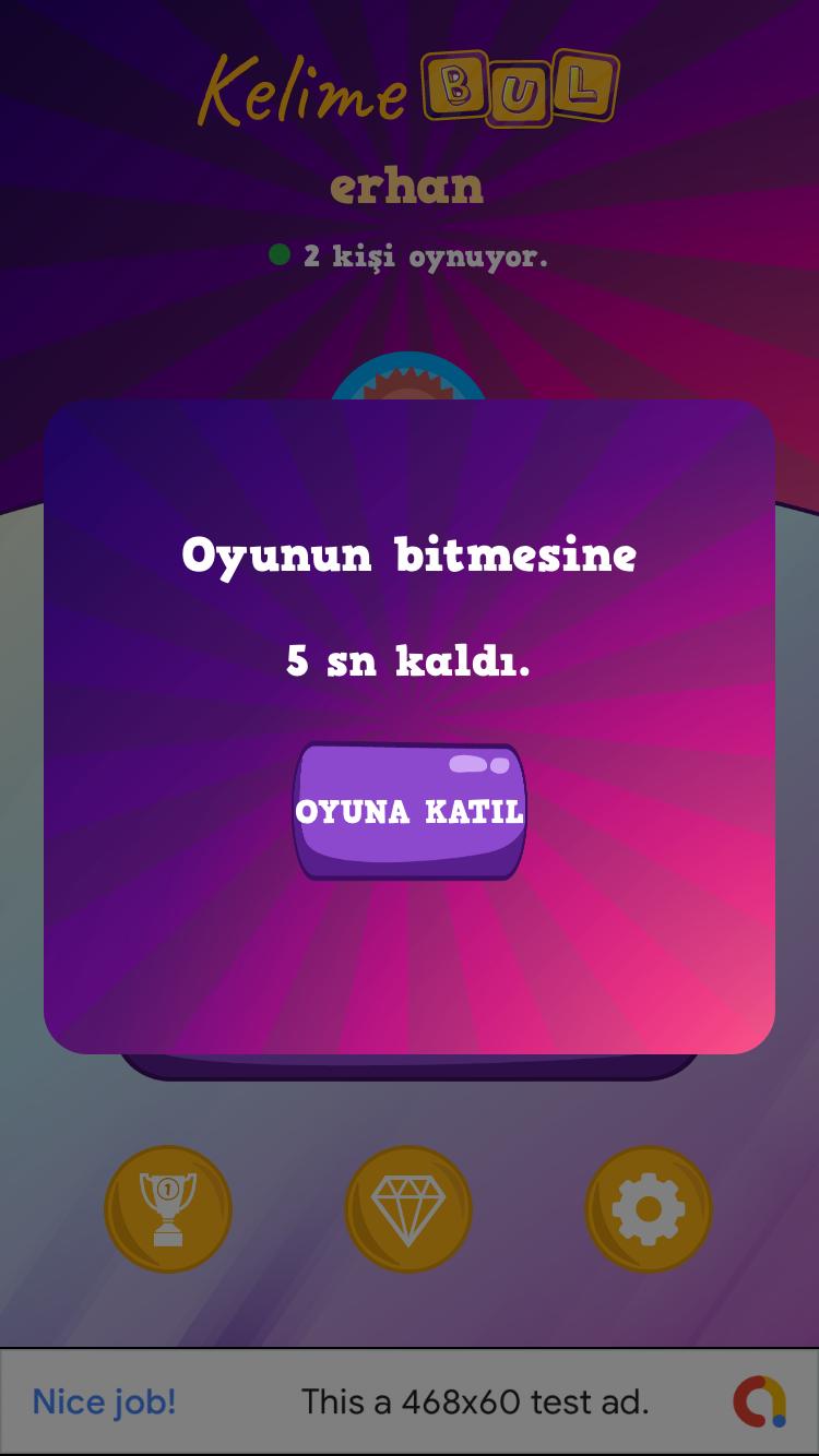
Kullanıcı oyuna katılmak istediğinde ona hosted service in o an geri sayarken ki saniyenisi dönüyoruz, signalr ile. Ve kalan süreyi bir kere client aldıktan sonra artık kendi cihazındaki timer ile sayma işlemi devam ediyor.
Bizim HostedService miz şu şekilde.
 internal class TimedHostedService : IHostedService, IDisposable
    {
        private readonly ILogger _logger;
        private readonly IHubContext _hubContext;
        public IServiceProvider Services { get; }
        private Timer _timer;

        public TimedHostedService(ILogger logger, IServiceProvider services, IHubContext hubContext)
        {
            _logger = logger;
            _hubContext = hubContext;
            Services = services;
        }

        public Task StartAsync(CancellationToken cancellationToken)
        {
            _logger.LogInformation("Timed Background Service is starting.");

            _timer = new Timer(GetNewGameAndBroadcast, null, TimeSpan.Zero, TimeSpan.FromSeconds(1));

            return Task.CompletedTask;
        }

        private async void GetNewGameAndBroadcast(object state)
        {
            if (TimerService.WaitDuration == 25)
            {
                _logger.LogInformation("Timed Background Service is working.");
                using (var scope = Services.CreateScope())
                {
                    var gameService = scope.ServiceProvider.GetRequiredService();
                    var game = await gameService.NewGame(4);
                    var gameJson = JsonConvert.SerializeObject(game);
                    TimerService.gameJson = gameJson;
                    try
                    {
                        await _hubContext.Clients.All.SendAsync("GameReceived", gameJson);
                    }
                    catch (Exception ex)
                    {
                         ...
                    }
                }
            }
        }

        public Task StopAsync(CancellationToken cancellationToken)
        {
            _logger.LogInformation("Timed Background Service is stopping.");

            _timer?.Change(Timeout.Infinite, 0);

            return Task.CompletedTask;
        }

        public void Dispose()
        {
            _timer?.Dispose();
        }
    }
Burada her bir saniyede ilgili metodu çalıştırıp eğer oyun bekleme süresinde ise zaten online olan kullanıcılar için yeni oyunu 25 saniye kala üretip IHubContext i kullanarak tüm kullanıcılara broadcast ediyoruz, bu durumda her online olan kişi süre bittiğinde aynı oyuna başlıyor, oyun sırasında dahil olanlarda bu oluşturulmuş olan oyunu alıp kalan saniyeden oyuna devam ediyorlar.
Bu yazımda bahsetmek istediklerim bu kadar. Bir sonraki yazımda asıl oyun için gerekli olan Grid i nasıl oluşturduk neler yaptık bundan bahsedeceğim.
Bir sonraki yazımda görüşmek üzere.
Tüm .Net Client Projelerimizde Ortak Kullanabileceğimiz Bir API Client yazalım.
Selamlar,
Daha önceden bahsetmiştim böyle bir konuya girmek istediğimi.
Yeni gelen HttpClientFactory ile de beraber daha önceden yazmış olduğum Resilient Network Services serisinin daha kısasını ve güncellenmiş halini kütüphanelerin detayların da çok fazla boğumladan yeniden incelemek istiyorum.
Amacımız şu;
Bir ApiClient Standard kütüphanesi oluşturalım. Solution ne kadar Client projemiz var ise Xamarin, Web, Console, UWP, WPF farketmez hepsi bu kütüphane üzerinden network haberleşmelerini yapsın(Http üzerinden)
Bu işlem sırasında da önceki yazılarımızda kullandığımız refit ve polly hatta akavache yi de kullanalım. ModernHttpClient a artık çok gerek yok, çünkü proje özelliklerinden Default mu yoksa platform spesifik sınıflarımı kullanmak istediğimizi zaten belirtebiliyoruz aşağıdaki gibi.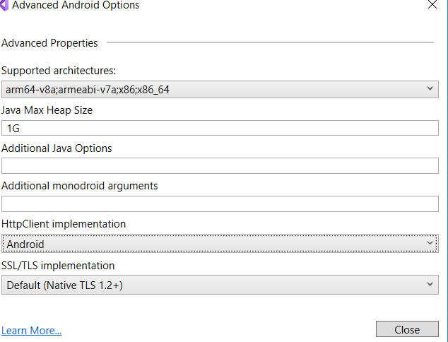
Burada HttpClient implementation ın Managed mı Default mu yoksa Android mi olduğunu seçebiliyoruz. iOS tarafında da durum aynı şekilde.
Peki çok uzatmadan bu kütüphanemizi yazmaya başlayalım ve Asp.Net Core Web App ve Xamarin projelerimizde de kullanalım bakalım.
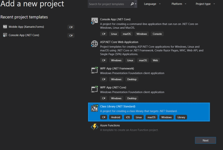
Bir adet boş solution açıp içerisine önce bir adet Asp.Net Core Web App ve bir adet de xamarin.forms projeleri ekleyelim.
Daha sonra Add New Project diyerek Bir adet .netstandard class library ekleyelim.
Bu kütüphanenin diğer tüm client projeleri tarafından kullanılabileceğine eminiz çünkü .netstandard kütüphanesi ekledik.
Projede kullanmak istediğimiz ve resilient network services kısmında bize yardımcı olacak 3 temel şey var.
- Polly
- Refit
- HttpClientFactory
Tüm bunların kullanımı için öncelikle aşağıdaki paketleri projeye teker teker ekliyoruz.
- Microsoft.Extensions.DependencyInjection
- Microsoft.Extensions.Http.Polly
- Refit.HttpClientFactory
- Xamarin.Essentials (xamarin tarafında kullanmak üzere şimdilik çok önemi yok)
Projede kullanmak için bir api yazmaktansa yine open apilardan randomuser kullanalım.
Bunun için daha önceki yazılarımda çokça detayına girdiğim için burada konuyu uzatmadan hemen refit interface imi oluşturucam. Sonrasında da örnek bir tane delegating Handler oluşturucam
Bunlar aşağıdaki gibi;
Random user api si ile haberleşecek olan Refit Interface i;
Projede Endpoints adında bir klasör açıp içerisine aşağıdaki interface i atıyorum
Burada amaç tüm farklı endpointleri ayrı ayrı interfaceler altında toplayıp hepsini ayrı ayrı konfigüre edebilmek.
 [Headers("Content-Type : application-json")]
    public interface IRandomUserApi
    {
        [Get("/")]
        Task<string> GetUser(string results);
    }
DelegatingHandler ım.
 public class AuthTokenHandler : DelegatingHandler
    {
        private readonly string _token;
        private const string TOKEN = "Authorization";
        public AuthTokenHandler(string token)
        {
            _token = token;
        }

        protected override async Task<HttpResponseMessage> SendAsync(HttpRequestMessage request, CancellationToken cancellationToken)
        {
            if (!request.Headers.Contains(TOKEN) && string.IsNullOrEmpty(_token))
            {
                return new HttpResponseMessage(HttpStatusCode.BadRequest)
                {
                    Content = new StringContent("Missing auth token.")
                };
            }
            else if (!request.Headers.Contains(TOKEN) && !string.IsNullOrEmpty(_token))
            {
                request.Headers.Add(TOKEN, $"Bearer {_token}");
            }

            var response = await base.SendAsync(request, cancellationToken);

            return response;
        }
    }
Bu iki kod bloğu ile ilgili daha detaylara girmek isterseniz aşağıdaki yazılarımı okuyabilirsiniz.
Projenin temel kısımları hazır oldu. Bundan sonraki yazımda asıl sınıfımız olan ApiClient sınıfını yazıp client projelerimizde kullanacağız.
Bir sonraki yazımda görüşmek üzere.
Asp.Net Core Dışında Bir .NetStandard Kütüphanemizde (Ör: Xamarin.Forms Shared Projede) HttpClientFactory Kullanımı.
Selamlar,
Başlık konusunda biraz kararsız kalmıştım. Değinmek istediğim noktayı şöyle anlatayım. Asp.Net Core projesi dışında bir Client ınız olduğunu düşünelim (Console App, Xamarin Mobile App, WinForms, WPF, UWP vs vs..), bu projeden API call ları HttpClientFactory kullanarak nasıl yapacaksınız buna değinmek istiyorum.
Önceki yazılarımda Networking taraflarındaki konulara çokça değinmişimdir. Günümüzde de bir .net projesinde http üzerinden haberleşmek için artık elimizde en iyi sınıf HttpClientFactory gibi duruyor. Ama danışmanlıklarım sırasında şunu çok gördüm.
Asp.Net Core un genel olarak çalışma yapısı insanlarda oturmamış. Microsoft un tüm paketleri ayrı ayrı yapmasının sebebi çok anlaşılmamış. .NetStandard nedir, Core nedir, kafalarda karışıklıklar var.
Bunlar la ilgili konulara değindiğim yazılarıma bakmanızı tavsiye ederim.
- .NetStandard nedir? .NetCore, .NetFramework ve diğer .Net Platformları ile ilişkisi nasıl? (Bölüm 1)
- Xamarin.Forms’da Kod Paylaşımı İçin .NET Standard 2.0 Kullanımı
- Asp.Net Core da HttpClientFactory Kullanımı (Basic Usage)
İnernettki örneklerin birçoğu HttpClientFactory kullanımını bir Asp.Net Core projesi üzerinden anlatıyor. Asp.Net Core projesinde ki startup dosyasında IServiceCollection a httpclientfacory yi, named typed vs gibi farklı tiplerde istediğiniz gibi tanıtıp sonra da kullanıyorsunuz.
Ama bir xamarin projesi karşımıza çıktığında ve bu xamarin projesinden dışarıya yapacak olduğumuz requestleri HttpClient ile değilde HttpClientFactory ile olmasını istetdiklerinde, ortalıka ne bir Startup var, ne ServiceCollection vs vs.
Bu durumda yapıpyı kurmakta zorluk çekildiğini gördüm.
Önce şundan bahsedelim.
Asp.Net Core daki IServiceCollection ın Asp.Net Core projesine geldiği dll
Microsoft.Extensions.DependencyInjection paketi. Peki bu paketi ben başka bir .NetStandard kütüphaneme ekleyemez miyim? Evet ekleyebilirim.
.NetStandard ın ne olduğunu hatırlayalım kısaca;
- Microsoft un .netframework ünün birden fazla implementasyonu var. Yani bu framework ü bir Interface olarak düşünürseniz farklı implementasyonlardan kastım şunlar olucaktır;
- UWP
- WPF
- Asp.Net – Asp.Net Core
- Xamarin
- Mono
- vs..
- Tüm bu platformlar arasında kod paylaşımı için .netstandard a kadar iki farklı yönetmimiz var idi. Portable Class Library ler ve Shared Asset Project idi.
- Microsoft artık tüm platformlar arasında kod paylaşımını kolaylaştırmak için ortaya bir standard koydu. .NetStandard. Artık her implementasyon bu standard içerisindeki API ları kendine eklemek zorunda idi
- İlk başlarda çok fazla API içerisinde barındırmayan .NetStandard artık 2.0 versiyonu ile veraber tüm full .netframework 4.6.1 deki api lara bile sahip hale geldi. İçerisinde artık binlerce API var. Bu da şu demek, eğer nugetten indirdiğiniz bir kütüphane ya da sizin target olarak .NetStandard seçerek oluşturmuş olduğunuz bir kütüphane neredeyse üm .net implementasyonlarında çalışır olucak demek.
Peki bu özet bilgi ile şöyle bir işe kalkışalım. Bir solution ımız olsun. Bu solution içerisinde şunlar olsun.
- Bir Asp.Net Core ile yazılmış API
- Bir Asp.Net Core Web App (Client)
- Bir Xamarin iOS ve Android App (Client)
- Bir Console App (Client)
- Bir WPF App (Client)
Ve şunu istiyor olalım.
Tüm clienlar çoğunlukla olacağı gibi aynı Apı mız ile haberleşerek istediği işlemleri yapsın. Ve bu Api ile haberleşirken de HttpClient değil HttpClientFactory kullansın.
Hatta Eski yazılarımda olduğu gibi öyle bir Api Haberleşme sınıfı yazalım ki, buraya Refit, Polly gibi kütüphaneleri de kullanıp yine güzel bir Resilient Network Service altyapısı oluşturalım.
Tüm bunlaru yapmadan önce başlıkta dediğim gibi bir xamarin uygulamasında HttpClientFactory yi nasıl kullanırım bunu görelim.
Bunu yapmanın aslında ne kadar basit olduğunu görünce biraz şaşırabilirsiniz özellikle .Netstandard ve .Net Core ile beraber Microsoft un birçok paketi ayrı ayrı sunmasının faydalarını daha önce keşfetmediyseniz…
Bir xamarin uygulamasını neredeyse bir Asp.Net Core uygulaması gibi görünmesini sağlamak için yapmam gereken ilk şey 2 adet paketi .NetStandard kütüphaneme eklemek. Platforms spesifik projelerle şuan için işim yok. Boş bir xamarin.forms projesi açtıktan sonra (Empty template ile) ilk olarak aşağıdaki paketleri yüklüyorum nugetten.
bu iki paket şunlar;
- Microsoft.Extensions.DependencyInjection
- Microsoft.Extensions.Http
ilk paket ile uygulamama bir DI özelliği katıyorum, bunun içinde autofac, unity, ninject vs gibi bir IoC container kullanmadan Microsft un kendi extension paketi üzerinden yürüyorum. Bu noktada artık bir Asp.Net Core projesinde yaptığımız gibi her istediğimiz api ı bu container a ekleyip bunun üzerinden erişbilir olduk bile.
Diğer pakete de bana Asp.Net Core projesinde DI container a AddHttpClient dememi sağlayan ve HttpClientFactory devreye sokan extension metodun geldiği paket. Bu noktadan itibaren de artık bir core web app e eklediğim gibi ClientFactory yi ekleyebilirim.
Bunun için bir IServiceCollection field ını App.cs tarafında oluşturdum. Eğer null ise Constructor new ServiceCollection diyerek Container ı oluşturuyorum.
Daha sonrada uygulama sayfalarımdan burada register etmiş olduğum service lere ulaşmak için IServiceProvider property mi oluşturuyorum. Bunu ayağa kaldırmak içinde tüm serviceleri register ettikten sonra BuildServiceProvider() diyerek provider objemi oluşturuyorum. App.cs de yapacaklarım bu kadar.
 public partial class App : Application
    {
        IServiceCollection services;
        internal static IServiceProvider ServiceProvider { get; private set; }
        public App()
        {
            InitializeComponent();

            if (services == null)
            {
                services = new ServiceCollection();
            }
            services.AddHttpClient();


            ServiceProvider = services.BuildServiceProvider();


            MainPage = new MainPage();
        }

         .....
App.cs de gerekli işlemleri bir kaç satır da hallettikten sonra, ki bu birkaç satırda şunları yapmış olduk;
- Bir DI mekanizması oluşurup IoC container kurduk
- Bu Container a IHttpClientFactory yi register ettik
artık MainPage e geldiğimde, aşağıdaki gibi ServiceProvider üzerinden ilgili service ime ulaşabilirim. Burada ulaşmak istediğimiz service de IHttpClientFactory nin kendisi.
 public partial class MainPage : ContentPage
    {
        IHttpClientFactory _clientFactory;

        public MainPage()
        {
            InitializeComponent();

            _clientFactory = App.ServiceProvider.GetRequiredService<IHttpClientFactory>();

            Task.Run(async () =>
            {
                var result = await _clientFactory.CreateClient().GetStringAsync("http://randomuser.me/api?results=1");

            });
        }
    }
_clientFactory = App.ServiceProvider.GetRequiredService(); dedikten sonra artık bu clienFactory normal bir asp.net core projemdeki gibi elimde. Burada basic usage olarak kullandığımız için hiçbir parametre verdeden CreateClient diyerek HttpClient ımızı oluşturup gerekli işlemlerimizi bunun üzerinden yapabiliriz.
Görmüş olduğunuz gibi Microsoft un Asp.Net Core ile beraber kurmuş olduğu yapı oldukça esnek ve birbiri ile kullanılmaya oldukça müsait. Bir xamarin projemizde HttpClientFactory yi ve hatta Microsoft kendi micro Container ını kullanmış olduk.
Bir sonraki yazımda görüşmek üzere.
Xamarin.Forms ConfinstaApp Sample Bölüm 4 – SlideOverKit, Swipable Menu
Selamlar,
Bu serimizin son yazısında yine çok faydalı bir plugin den bahsetmek istiyorum. Hem bu örnek boyunca ilerlemiş olduğumuz Confinsta app i sona erdirecek hem de uygulamalarımızda bizden ekranın farklı yerlerinde farklı şekillerde açılıp kapanan menüler istendiğinde bunu kısa ve hızlı bir şekilde nasıl hallederiz buna bakacağız.
Kullanacak olduğumuz pluginimiz SlideOverKit
Yine solutionımızdaki her projeye bunu ekledikten sonrai plaform spesifik taraflarda gerekli initialize işlemini yapıyoruz.
Detaylı kullanımı için SlideOverKit in kendi github sayfasını ve örneklerini incelemenizi öneririm. Buradan ulaşabilirsiniz.
Bu plugin confinsta app boyunca Customrenderer yazmış olmamı gerekitiren tek şey. Ama aslında yazacağınız custom renderer ın örneklerden alıp copy paste yapmaktan başka neredeyse değiştirmeniz gereken peki bir kısmı kalmıyor(class isimleri hariç) 🙂
Ama arka planda neler yaptığını bilmek isterseniz benim gibi github dan inceleyebilirsiniz.
Önce bir ekranı hatırlayalım, sonra da tek tek kod taraflarına bakalım.


Resimde gördüğünüz gibi, sağ üst köşede ki hamburger buton ikonuna basıldığında ekranın yarısı kadar ene sahip ve tam boyda bir menü sayfası açıyoruz. Tıpkı instagramda olduğu gibi.
Önce sayfanın kendisine bir bakalım.
Sayfada yukarıdaki gibi bir navigation bar kullanmak eskiden custom renderer yazmak gerektirirdi. Ama yeni gelen özellikler ile sayfanın NavigationView ını istediğimiz gibi design edebiliyoruz artık xaml tarafında. Ben sağ üst köşeye bir imaj koydum ve buna bir tapgesture ekledim. Basıldığında da menü yü toggle ediyorum. Bu kadar. Xaml tarafı şu şekilde.
<?xml version="1.0" encoding="utf-8" ?>
<ContentPage xmlns="http://xamarin.com/schemas/2014/forms"
             xmlns:x="http://schemas.microsoft.com/winfx/2009/xaml"
             x:Class="ConfinstaApp.Views.ProfileView">

    <NavigationPage.TitleView>
        <StackLayout HorizontalOptions="FillAndExpand" Orientation="Horizontal" Padding="10,0,10,0" Spacing="10">
            <Image Source="17.png" HorizontalOptions="StartAndExpand" WidthRequest="25" HeightRequest="25"></Image>
            <Label Text="erhanballieker" FontSize="Medium" FontAttributes="Bold" HorizontalOptions="CenterAndExpand" VerticalOptions="Center" Margin="0,0,25,0"/>
            <Image Source="11.png" HorizontalOptions="End" WidthRequest="25" HeightRequest="25">
                <Image.GestureRecognizers>
                    <TapGestureRecognizer Tapped="TapGestureRecognizer_Tapped"></TapGestureRecognizer>
                </Image.GestureRecognizers>
            </Image>
        </StackLayout>
    </NavigationPage.TitleView>

    <ContentPage.Content>
        <StackLayout HorizontalOptions="Center" VerticalOptions="Center">
            <Label FontSize="Medium" FontAttributes="Bold" Text="erhanballieker Profile Page" HorizontalOptions="Center"></Label>
        </StackLayout>
    </ContentPage.Content>
</ContentPage>
Yukarıda gördüğünüz gibi NavigationPage.TitleView içerisinde navigation design ım var. Sayfanın content ine hiçbir şey koymadım (Bir adet label ) dışında çünkü burada odaklandığımız yer sayfa içerisine eklediğimiz açılıp kapanan menü.
Sayfanın backend tarafı ise aşağıdaki gibi. Dikkat etmemiz gereken tek şey, Sayfanın ContentPage dışında bir de IMenuContainerPage interface ini implemente etmiş olması.
Bu interface den bize 3 adet property geliyor.
Bunlar;
- SlideMenu Tipinde bir SlideMenu Prop u
- Action tipinde bir ShowMenuAction prop u
- Action tipinde bir HideMenuAction prop u
bunlar dışında sayfada sadece hamburger butonun gesturetapped event i var.
Bir diğer dikkat edeceğimiz nokta ise sayfanın constructor nda bana interface den gelen SlideMenu propertysine atadığım RightSideMenuContentView.
	[XamlCompilation(XamlCompilationOptions.Compile)]
	public partial class ProfileView : ContentPage, IMenuContainerPage
        {
           public ProfileView()
	   {
	       InitializeComponent ();

               this.SlideMenu = new RightSideMenuContentView();
            }

        public SlideMenuView SlideMenu { get; set; }
        public Action ShowMenuAction { get; set; }
        public Action HideMenuAction { get; set; }

        private async void TapGestureRecognizer_Tapped(object sender, EventArgs e)
        {
            if (this.SlideMenu.IsShown)
            {
                HideMenuAction?.Invoke();
            }
            else
            {
                ShowMenuAction?.Invoke();
            }
        }
    }
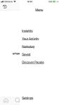
RightSideMenuContentView ın xaml tarafına bir bakalım. Projemize bir adet ContentView ekleyip xaml tarafını aşağıdaki gibi düzenliyoruz.Basit bir StackLayout içerisinde bir kaç label var. Ama dikkat etmemiz gereken şey tüm sayfanın namespacinin SlideOverKit den geliyor olması.
<?xml version="1.0" encoding="utf-8" ?>
<t:SlideMenuView xmlns="http://xamarin.com/schemas/2014/forms"
                 xmlns:x="http://schemas.microsoft.com/winfx/2009/xaml"
                 xmlns:t="clr-namespace:SlideOverKit"
                 x:Class="ConfinstaApp.Views.SlideViews.RightSideMenuContentView">

    <StackLayout Padding="15,50,15,30" Spacing="20" VerticalOptions="FillAndExpand" HorizontalOptions="FillAndExpand">

        <Label HeightRequest="30" Margin="0,0,0,80" Text="Menu" FontSize="20" XAlign="Center" TextDecorations="Underline" />

        <Label HeightRequest="30" Text="Insights" FontSize="20" XAlign="Start" YAlign="Center" TextDecorations="Underline" />
        <Label HeightRequest="30" Text="Your Activity" FontSize="20" XAlign="Start" YAlign="Center" TextDecorations="Underline"/>
        <Label HeightRequest="30" Text="Nametag" FontSize="20" XAlign="Start" YAlign="Center" TextDecorations="Underline"/>
        <Label HeightRequest="30" Text="Saved" FontSize="20" XAlign="Start" YAlign="Center" TextDecorations="Underline"/>
        <Label HeightRequest="30" Text="Discover People" FontSize="20" XAlign="Start" YAlign="Center" TextDecorations="Underline"/>
        <Image HeightRequest="40" Source="nature.png"></Image>
        <Label HeightRequest="30" Text="Settings" FontSize="20" XAlign="Start" YAlign="Center" VerticalOptions="EndAndExpand" TextDecorations="Underline"/>

    </StackLayout>
</t:SlideMenuView>
Slide menünün backend tarafına bakalım. ContentView dan değil de SlideMenuView dan miras alıyor olmamız ilk dikkat çeken nokta. Bu miras ın bize sunduğu bir kaç property ile de nasıl görüneceğini ayarlıyoruz.
IsFullScreen true diyerek tam sayfa açılır olmasını söylüyoruz.
WidthRequest ile istediğimiz genişliği söylüyoruz.
MenuOrienations ı RightToLeft diyerek sağdan sola açılmasını belirtiyoruz.
[XamlCompilation(XamlCompilationOptions.Compile)]
	public partial class RightSideMenuContentView : SlideMenuView
    {
		public RightSideMenuContentView()
		{
			InitializeComponent ();
                        this.IsFullScreen = true;
                        this.WidthRequest = 250;
                        this.MenuOrientations = MenuOrientation.RightToLeft;

                        this.BackgroundColor = Color.White;
                        this.BackgroundViewColor = Color.Transparent;
                }
    }
Daha öncede de söylediğim gibi tüm projenin içerisinde sadece bir adet custom renderer var. o da bu plugin i kullanılabilir kulmak için. iOS Custom Renderer Kısmı aşağıdaki gibi.
[assembly: ExportRenderer(typeof(ProfileView), typeof(ProfileViewRenderer))]

namespace ConfinstaApp.iOS
{
    public class ProfileViewRenderer : PageRenderer, ISlideOverKitPageRendereriOS
    {
        public Action ViewDidAppearEvent { get; set; }

        public Action OnElementChangedEvent { get; set; }

        public Action ViewDidLayoutSubviewsEvent { get; set; }

        public Action ViewDidDisappearEvent { get; set; }

        public Action<CGSize, IUIViewControllerTransitionCoordinator> ViewWillTransitionToSizeEvent { get; set; }

        public ProfileViewRenderer()
        {
            new SlideOverKitiOSHandler().Init(this);
        }

        protected override void OnElementChanged(VisualElementChangedEventArgs e)
        {
            base.OnElementChanged(e);

            OnElementChangedEvent?.Invoke(e);
        }

        public override void ViewDidLayoutSubviews()
        {
            base.ViewDidLayoutSubviews();
            ViewDidLayoutSubviewsEvent?.Invoke();

        }

        public override void ViewDidAppear(bool animated)
        {
            base.ViewDidAppear(animated);
            ViewDidAppearEvent?.Invoke(animated);

        }

        public override void ViewDidDisappear(bool animated)
        {
            base.ViewDidDisappear(animated);
            ViewDidDisappearEvent?.Invoke(animated);
        }

        public override void ViewWillTransitionToSize(CGSize toSize, IUIViewControllerTransitionCoordinator coordinator)
        {
            base.ViewWillTransitionToSize(toSize, coordinator);
            ViewWillTransitionToSizeEvent?.Invoke(toSize, coordinator);
        }
    }
}
Custom renderer kullanmak zorunda olmanın yanında bir iyi haber ise şu. SlideOverKit sample larından aldığınız bir ios yada android rendererlarda sadece class isimlerini düzeltip başka bir customization yapmasanız bile proje çalışır hale gelecektir. Yani aslında tam da custom renderer yazıyor sayılmazsınız.
Android Custom Renderer kısmı
[assembly: ExportRenderer(typeof(ProfileView), typeof(ProfileViewRenderer))]
namespace ConfinstaApp.Droid
{

    public class ProfileViewRenderer : PageRenderer, ISlideOverKitPageRendererDroid
    {
        public Action OnElementChangedEvent { get; set; }

        public Action<bool, int, int, int, int> OnLayoutEvent { get; set; }

        public Action<int, int, int, int> OnSizeChangedEvent { get; set; }

        public ProfileViewRenderer (Context context) : base (context)
        {
            new SlideOverKitDroidHandler ().Init (this, context);
        }

        protected override void OnElementChanged (ElementChangedEventArgs e)
        {
            base.OnElementChanged (e);
            OnElementChangedEvent?.Invoke (e);
        }

        protected override void OnLayout (bool changed, int l, int t, int r, int b)
        {
            base.OnLayout (changed, l, t, r, b);
            OnLayoutEvent?.Invoke (changed, l, t, r, b);
        }

        protected override void OnSizeChanged (int w, int h, int oldw, int oldh)
        {
            base.OnSizeChanged (w, h, oldw, oldh);
            OnSizeChangedEvent?.Invoke (w, h, oldw, oldh);
        }
    }
}
Evet tüm hikaye bu kadar. .NetConf 2018 de sunumunu yapmış olduğum ve yaklaşık 1 iş günümü almış olan (sadece ui olduğu için :)) bir app in, xamarin forms ile ve xamarin forms a yeni gelen özellikler ile de nasıl bir şey ortaya çıkarabildiğini gördük.
Ekranları bir hatırlayalım.


Xamarin.Forms özelinde faydalı örneklerle dolu olduğunu düşündüğüm bu Confinsta app in proje haline buradan ulaşabilirsiniz. Aynı şekilde aynı gün yapmış olduğum diğer sunum dosyaları ve projeler burada mevcut.
Bir sonraki yazımda görüşmek üzere.
Xamarin.Forms ConfinstaApp Sample Bölüm 3
Selamlar,
Confinsta app in detaylarını incelemeye devam ediyoruz. Bu bölümde xamarin.forms un yeni gelen özellikleri ile de birlikte 1 gün gibi kısa bir sürede ne şekilde ui lar çıkartabileceğimizi örneklemeye çalıştığım Confinsta app de, kullanıcıların fotoğraflarının kimler tarafından beğenildiğini ve hangi fotoğraflarının beğenildiğini görecekleri ve kimlerin kendisini Follow ettiklerini görecekleri 2 tab lı sayfadan oluşan sayfamızı inceleyeceğiz.
Bu sayfa içerisinde kullandığım temel özellikler şöyle;
- Syncfusion TabView
- FlexLayout
- ListView, GroupedListView
- BindableSpan
gibi özellikler bulunuyor.
Sayfaların görüntülerini hatırlayalım.


Sayfanın en temel özelliği, parmak ile sağa sola swipe edilerek tabların geçişlerini de sağlayan Syncfusion ın TabView ı üzerine kurulu olması. syncfusion ın ChartBar ları dışında en çok kullandığım paketi bu paket. Bir çok uygulamada buna benzer swipe ile geçişi istenen tablı yapılar mevcut. Özellikle iOS native tarafta bile bunu yapmak için ayrı cocoaPod ihtiyaç duyacakken böyle bir yapıyı custom rendererlar ile yapmak çok akıl karı değil. Bu yüzden kullanmaya kaçınsam da, bazı durumlarda paralı paketleri kullanmak gerekebiliyor, özellikle zamanınız dar ise 🙂
Sayfa iki tab a ayrılmış durumda. Soldaki tab da kullanıcıların sizin resimlerinizden beğendiklerini listeliyoruz. Sağda ise sizi takip edilenler gösteriliyor. Özellikle sol taraftaki her bir kullanıcının altında “sizin şu resimleriniz beğendi” ile beraber resimlerin dinamil geldiğini görsem ve FlexLayout olmasa yine sinir olurdum. Ama bir önceki yazımda gördüğümüz gibi FlexLayout ile bu tarz ui lar çok basit hale geliyor.
Gelelim sayfanın xaml tarafına. Sayfada ki iki farklı ekranı da aslında aynı xaml dosyası içinde tanımlayabiliyoruz. Aslında tabii bunları ayrı ContentView lar olarak tanımlayıp TabView ın olduğu sayfada referanslarınıda verebilirdik (ilk yazıda Tabbed page template inde kullandığımız yapı gibi).
Sayfanın xaml tarafı şu şekilde.
<?xml version="1.0" encoding="utf-8" ?>
<ContentPage xmlns="http://xamarin.com/schemas/2014/forms"
xmlns:x="http://schemas.microsoft.com/winfx/2009/xaml"
xmlns:tabView="clr-namespace:Syncfusion.XForms.TabView;assembly=Syncfusion.SfTabView.XForms"
xmlns:controls="clr-namespace:ImageCircle.Forms.Plugin.Abstractions;assembly=ImageCircle.Forms.Plugin"
x:Class="ConfinstaApp.Views.FeedActivityView">
<ContentPage.Content>
<tabView:SfTabView VisibleHeaderCount="2" TabHeaderBackgroundColor="White" x:Name="mainTabView" Margin="0,20,0,0">
<tabView:SfTabItem Title="Following" TitleFontAttributes="Bold" TitleFontColor="Black" TitleFontSize="15">
<tabView:SfTabItem.Content>
<StackLayout>
<ListView x:Name="FollowingFeedListView"
ItemsSource="{Binding FollowingItems}"
SelectionMode="None"
SeparatorVisibility="None"
HasUnevenRows="true"
RefreshCommand="{Binding LoadFollowingFeedListCommand}"
IsPullToRefreshEnabled="true"
IsRefreshing="{Binding IsBusy, Mode=OneWay}"
CachingStrategy="RecycleElement">
<ListView.ItemTemplate>
<DataTemplate>
<ViewCell Appearing="ViewCell_Appearing">
<Grid RowSpacing="5" Padding="10">
<Grid.RowDefinitions>
<RowDefinition Height="50"></RowDefinition>
<RowDefinition Height="Auto"></RowDefinition>
</Grid.RowDefinitions>
<Grid.ColumnDefinitions>
<ColumnDefinition Width="50"></ColumnDefinition>
<ColumnDefinition Width="*"></ColumnDefinition>
</Grid.ColumnDefinitions>
<controls:CircleImage BorderThickness="2"
BorderColor="#ab423f"
WidthRequest="40"
HeightRequest="40"
Source="{Binding ProfileUrl}"
Aspect="AspectFit"
Grid.Row="0"
Grid.Column="0"></controls:CircleImage>
<Label LineBreakMode="TailTruncation"
FontSize="Small"
Grid.Column="1"
Grid.Row="0"
VerticalOptions="Center"
TextColor="Black">
<Label.FormattedText>
<FormattedString>
<Span Text="{Binding Name}" FontAttributes="Bold" FontSize="Small"></Span>
<Span Text=" liked some posts." TextColor="DarkGray" FontAttributes="None" FontSize="Small"></Span>
</FormattedString>
</Label.FormattedText>
</Label>
<FlexLayout x:Name="imagesLayout"
Wrap="Wrap"
JustifyContent="Start"
Direction="Row"
Grid.Row="1"
Grid.Column="1"></FlexLayout>
</Grid>
</ViewCell>
</DataTemplate>
</ListView.ItemTemplate>
</ListView>
</StackLayout>
</tabView:SfTabItem.Content>
</tabView:SfTabItem>
<tabView:SfTabItem Title="You" FontIconFontAttributes="Bold" TitleFontColor="Black" TitleFontSize="15">
<tabView:SfTabItem.Content>
<StackLayout>
<StackLayout>
<ListView x:Name="AboutYouFeedListView"
ItemsSource="{Binding GroupedItems}"
SelectionMode="None"
IsGroupingEnabled="True"
GroupDisplayBinding="{Binding Key}"
SeparatorVisibility="None"
HasUnevenRows="true"
RefreshCommand="{Binding LoadFollowingFeedListCommand}"
IsPullToRefreshEnabled="true"
IsRefreshing="{Binding IsBusy, Mode=OneWay}"
CachingStrategy="RecycleElement">
<ListView.ItemTemplate>
<DataTemplate>
<ViewCell Appearing="ViewCell_Appearing">
<Grid RowSpacing="5" Padding="10">
<Grid.RowDefinitions>
<RowDefinition Height="Auto"></RowDefinition>
</Grid.RowDefinitions>
<Grid.ColumnDefinitions>
<ColumnDefinition Width="40"></ColumnDefinition>
<ColumnDefinition Width="*"></ColumnDefinition>
<ColumnDefinition Width="100"></ColumnDefinition>
</Grid.ColumnDefinitions>
<controls:CircleImage BorderThickness="2"
BorderColor="#ab423f"
WidthRequest="30"
HeightRequest="30"
Source="{Binding ProfileUrl}"
Aspect="AspectFill"
Grid.Column= "0"></controls:CircleImage>
<Label LineBreakMode="TailTruncation"
FontSize="Small"
Grid.Column="1"
VerticalOptions="Center"
MaxLines="3"
TextColor="Black">
<Label.FormattedText>
<FormattedString>
<Span Text="{Binding Name}" FontAttributes="Bold" FontSize="Small"></Span>
<Span Text=" lstarted following you" TextColor="DarkGray" FontAttributes="None" FontSize="Small"></Span>
</FormattedString>
</Label.FormattedText>
</Label>
<Button BackgroundColor="#3893e8"
TextColor="White"
Text="Follow"
CornerRadius="10"
WidthRequest="80"
HeightRequest="40"
Grid.Column="2"></Button>
</Grid>
</ViewCell>
</DataTemplate>
</ListView.ItemTemplate>
</ListView>
</StackLayout>
</StackLayout>
</tabView:SfTabItem.Content>
</tabView:SfTabItem>
</tabView:SfTabView>
</ContentPage.Content>
</ContentPage>
aslında ana yapı şu şekilde; Bir adet SFTabView. Bunun içerisine iki adet SfTabItem. Bunların içerisinde de yukarıda görmüş olduğunuz gibi sanki bir ContentPage in Content tag ının içini doldurur gibi sayfamızın xaml kodlarını dolduruyoruz.
        <tabView:SfTabView VisibleHeaderCount="2" TabHeaderBackgroundColor="White" x:Name="mainTabView" Margin="0,20,0,0">
            <tabView:SfTabItem Title="Following" TitleFontAttributes="Bold" TitleFontColor="Black" TitleFontSize="15">
                <tabView:SfTabItem.Content>

                </tabView:SfTabItem.Content>
            </tabView:SfTabItem>
            <tabView:SfTabItem Title="You" FontIconFontAttributes="Bold" TitleFontColor="Black" TitleFontSize="15">
                <tabView:SfTabItem.Content>
                    <StackLayout>

                </tabView:SfTabItem.Content>
            </tabView:SfTabItem>
        </tabView:SfTabView>
Sayfanın backend tarafına bakığımızda durum aşağıdaki gibi. Sadece yine anasayfadakine benzer bir trick kullanıyoruz. sayfadaki ListView ın ViewCell_Appearing event i içerisinde, sayfaya bind etmiş olduğumuz model in içerisindeki, o anda ki satıra denk gelen model içerisinde ki fotoğraf sayısı kadar dönüp, bir image oluşturup flexlayou un Children property sine ekliyoruz. Gerisini resimde görmüş olduğunuz gibi kaç satır ve sütunda göstereceğine kendisi karar veriyor.
[XamlCompilation(XamlCompilationOptions.Compile)]
	public partial class FeedActivityView : ContentPage
	{
        FeedActivityViewModel viewModel;
		public FeedActivityView ()
		{
			InitializeComponent ();
            NavigationPage.SetHasNavigationBar(this, false);
            viewModel = new FeedActivityViewModel();
            BindingContext = viewModel;
		}

        private void ViewCell_Appearing(object sender, EventArgs e)
        {
            if (sender is ViewCell cell)
            {
                if (cell.BindingContext is FollowingItemModel viewModel)
                {
                    var flexLayout = cell.FindByName("imagesLayout");

                    if (flexLayout?.Children.Count == 0 && viewModel.IamgeUrls.Count > 0)
                    {
                        foreach (var url in viewModel.IamgeUrls)
                        {
                            flexLayout.Children.Add(new Image
                            {
                                Source = new UriImageSource
                                {
                                    Uri = new Uri(url),
                                    CacheValidity = TimeSpan.FromDays(1),
                                    CachingEnabled = true
                                },
                                WidthRequest = 40,
                                HeightRequest = 40,
                                Margin = new Thickness { Left = 5, Bottom = 0, Right = 0, Top = 5},
                                Aspect = Aspect.AspectFill
                            });
                        }
                    }
                }
            }
        }
    }
Sayfanın backendinde başka bir numara yok. Viewmodel e baktığımızda ise durum şöyle;
public class FeedActivityViewModel : BaseViewModel
    {
        public FeedActivityViewModel()
        {
            FollowingItems = new ObservableCollection();
            AboutYouItems = new ObservableCollection();
            LoadFollowingItems();
            LoadAboutYouItems();

            GroupedItems = AboutYouItems.GroupBy(x => x.GroupName);

            LoadFollowingFeedListCommand = new Command(() => { LoadMoreActivity(); });
        }

        private void LoadMoreActivity()
        {
            if (IsBusy)
                return;

            IsBusy = true;

            LoadFollowingItems();

            IsBusy = false;
        }

        private void LoadFollowingItems()
        {
            FollowingItems.Add(new FollowingItemModel
            {
                Name = "Ian Dooley",
                ProfileUrl = "https://randomuser.me/api/portraits/women/41.jpg",
                IamgeUrls = new List { "https://images.unsplash.com/photo-1539608170043-f55d83afe1c9?ixlib=rb-0.3.5&ixid=eyJhcHBfaWQiOjEyMDd9&s=89a54fa339be3dde93fa137a213655c7&auto=format&fit=crop&w=1189&q=80",
                "https://images.unsplash.com/photo-1539604880233-d282d9bac272?ixlib=rb-0.3.5&ixid=eyJhcHBfaWQiOjEyMDd9&s=902aa0705d67ac390c0170c68aa4907f&auto=format&fit=crop&w=1051&q=80",
                "https://images.unsplash.com/photo-1539593608687-ccae798ff3ba?ixlib=rb-0.3.5&ixid=eyJhcHBfaWQiOjEyMDd9&s=abbf25cb0a9e3f706263ff5fa81bf9d9&auto=format&fit=crop&w=1051&q=80" }
            });
            FollowingItems.Add(new FollowingItemModel
            {
                Name = "Christian Becker",
                ProfileUrl = "https://randomuser.me/api/portraits/women/81.jpg",
                IamgeUrls = new List { "https://images.unsplash.com/photo-1539553521736-053bd7e14cf5?ixlib=rb-0.3.5&ixid=eyJhcHBfaWQiOjEyMDd9&s=debb88414bb2ee774ce6229a72adac17&auto=format&fit=crop&w=500&q=60",
                "https://images.unsplash.com/photo-1539547018184-e5b1ce85fb07?ixlib=rb-0.3.5&s=1358c21c9ecdbbd65dd2993958ee4021&auto=format&fit=crop&w=500&q=60" }
            });
            FollowingItems.Add(new FollowingItemModel
            {
                Name = "Velizer Ivanov",
                ProfileUrl = "https://randomuser.me/api/portraits/women/69.jpg",
                IamgeUrls = new List { "https://images.unsplash.com/photo-1539572996946-c0665d491f04?ixlib=rb-0.3.5&ixid=eyJhcHBfaWQiOjEyMDd9&s=3ed5d83abf5f65bfae42fec7c5e44dd2&auto=format&fit=crop&w=500&q=60",
                "https://images.unsplash.com/photo-1539550298564-8a06769aa728?ixlib=rb-0.3.5&ixid=eyJhcHBfaWQiOjEyMDd9&s=5a3cdac18faf595762d48ac529233dd3&auto=format&fit=crop&w=500&q=60",
                "https://images.unsplash.com/photo-1539546978801-fbee5d0fe203?ixlib=rb-0.3.5&ixid=eyJhcHBfaWQiOjEyMDd9&s=1f2df90670dbf90177e118ff434fd708&auto=format&fit=crop&w=500&q=60",
            "https://images.unsplash.com/photo-1539546978801-fbee5d0fe203?ixlib=rb-0.3.5&ixid=eyJhcHBfaWQiOjEyMDd9&s=1f2df90670dbf90177e118ff434fd708&auto=format&fit=crop&w=500&q=60",
            "https://images.unsplash.com/photo-1539547018184-e5b1ce85fb07?ixlib=rb-0.3.5&s=1358c21c9ecdbbd65dd2993958ee4021&auto=format&fit=crop&w=500&q=60",
            "https://images.unsplash.com/photo-1539608170043-f55d83afe1c9?ixlib=rb-0.3.5&ixid=eyJhcHBfaWQiOjEyMDd9&s=89a54fa339be3dde93fa137a213655c7&auto=format&fit=crop&w=1189&q=80",
            "https://images.unsplash.com/photo-1539546978801-fbee5d0fe203?ixlib=rb-0.3.5&ixid=eyJhcHBfaWQiOjEyMDd9&s=1f2df90670dbf90177e118ff434fd708&auto=format&fit=crop&w=500&q=60",
            }
            });
            FollowingItems.Add(new FollowingItemModel { Name = "Sam Dawson", ProfileUrl = "https://randomuser.me/api/portraits/women/20.jpg", IamgeUrls = new List { "https://images.unsplash.com/photo-1539607547234-e09cdb14d473?ixlib=rb-0.3.5&ixid=eyJhcHBfaWQiOjEyMDd9&s=ccf5de3e1f25a87315d6201723d67d26&auto=format&fit=crop&w=500&q=600" } });
            FollowingItems.Add(new FollowingItemModel
            {
                Name = "Simon King",
                ProfileUrl = "https://randomuser.me/api/portraits/women/57.jpg",
                IamgeUrls = new List { "https://images.unsplash.com/photo-1539602783210-221ffbec8280?ixlib=rb-0.3.5&ixid=eyJhcHBfaWQiOjEyMDd9&s=4b5bf2be9796a2d7b9b005a7cbf28372&auto=format&fit=crop&w=500&q=60"
                , "https://images.unsplash.com/photo-1539602783210-221ffbec8280?ixlib=rb-0.3.5&ixid=eyJhcHBfaWQiOjEyMDd9&s=4b5bf2be9796a2d7b9b005a7cbf28372&auto=format&fit=crop&w=500&q=60", "https://images.unsplash.com/photo-1539602783210-221ffbec8280?ixlib=rb-0.3.5&ixid=eyJhcHBfaWQiOjEyMDd9&s=4b5bf2be9796a2d7b9b005a7cbf28372&auto=format&fit=crop&w=500&q=60" }
            });
            FollowingItems.Add(new FollowingItemModel
            {
                Name = "Ian Dooley",
                ProfileUrl = "https://randomuser.me/api/portraits/women/23.jpg",
                IamgeUrls = new List { "https://images.unsplash.com/photo-1539587310936-afda09bd0dc7?ixlib=rb-0.3.5&ixid=eyJhcHBfaWQiOjEyMDd9&s=daf5f114d2545336bcab3e53bc4568e1&auto=format&fit=crop&w=500&q=60",
                "https://images.unsplash.com/photo-1539602010674-1346135ab34e?ixlib=rb-0.3.5&ixid=eyJhcHBfaWQiOjEyMDd9&s=eb91750f2ad63d82661fb76b0772d6fd&auto=format&fit=crop&w=500&q=60",
                "https://images.unsplash.com/photo-1539585173613-89e3967da7d5?ixlib=rb-0.3.5&ixid=eyJhcHBfaWQiOjEyMDd9&s=18ea6cc3988589adb75af4d8fe57d959&auto=format&fit=crop&w=500&q=60",
             "https://images.unsplash.com/photo-1539546978801-fbee5d0fe203?ixlib=rb-0.3.5&ixid=eyJhcHBfaWQiOjEyMDd9&s=1f2df90670dbf90177e118ff434fd708&auto=format&fit=crop&w=500&q=60",
            "https://images.unsplash.com/photo-1539547018184-e5b1ce85fb07?ixlib=rb-0.3.5&s=1358c21c9ecdbbd65dd2993958ee4021&auto=format&fit=crop&w=500&q=60",
            "https://images.unsplash.com/photo-1539608170043-f55d83afe1c9?ixlib=rb-0.3.5&ixid=eyJhcHBfaWQiOjEyMDd9&s=89a54fa339be3dde93fa137a213655c7&auto=format&fit=crop&w=1189&q=80",
            "https://images.unsplash.com/photo-1539546978801-fbee5d0fe203?ixlib=rb-0.3.5&ixid=eyJhcHBfaWQiOjEyMDd9&s=1f2df90670dbf90177e118ff434fd708&auto=format&fit=crop&w=500&q=60",
            "https://images.unsplash.com/photo-1539546978801-fbee5d0fe203?ixlib=rb-0.3.5&ixid=eyJhcHBfaWQiOjEyMDd9&s=1f2df90670dbf90177e118ff434fd708&auto=format&fit=crop&w=500&q=60",
            "https://images.unsplash.com/photo-1539547018184-e5b1ce85fb07?ixlib=rb-0.3.5&s=1358c21c9ecdbbd65dd2993958ee4021&auto=format&fit=crop&w=500&q=60",
            "https://images.unsplash.com/photo-1539608170043-f55d83afe1c9?ixlib=rb-0.3.5&ixid=eyJhcHBfaWQiOjEyMDd9&s=89a54fa339be3dde93fa137a213655c7&auto=format&fit=crop&w=1189&q=80",
            "https://images.unsplash.com/photo-1539546978801-fbee5d0fe203?ixlib=rb-0.3.5&ixid=eyJhcHBfaWQiOjEyMDd9&s=1f2df90670dbf90177e118ff434fd708&auto=format&fit=crop&w=500&q=60", "https://images.unsplash.com/photo-1539546978801-fbee5d0fe203?ixlib=rb-0.3.5&ixid=eyJhcHBfaWQiOjEyMDd9&s=1f2df90670dbf90177e118ff434fd708&auto=format&fit=crop&w=500&q=60",
            "https://images.unsplash.com/photo-1539547018184-e5b1ce85fb07?ixlib=rb-0.3.5&s=1358c21c9ecdbbd65dd2993958ee4021&auto=format&fit=crop&w=500&q=60",
            "https://images.unsplash.com/photo-1539608170043-f55d83afe1c9?ixlib=rb-0.3.5&ixid=eyJhcHBfaWQiOjEyMDd9&s=89a54fa339be3dde93fa137a213655c7&auto=format&fit=crop&w=1189&q=80",
            "https://images.unsplash.com/photo-1539546978801-fbee5d0fe203?ixlib=rb-0.3.5&ixid=eyJhcHBfaWQiOjEyMDd9&s=1f2df90670dbf90177e118ff434fd708&auto=format&fit=crop&w=500&q=60",}
            });
            FollowingItems.Add(new FollowingItemModel
            {
                Name = "Christian Becker",
                ProfileUrl = "https://randomuser.me/api/portraits/women/41.jpg",
                IamgeUrls = new List { "https://images.unsplash.com/photo-1539608170043-f55d83afe1c9?ixlib=rb-0.3.5&ixid=eyJhcHBfaWQiOjEyMDd9&s=89a54fa339be3dde93fa137a213655c7&auto=format&fit=crop&w=1189&q=80",
                "https://images.unsplash.com/photo-1539604880233-d282d9bac272?ixlib=rb-0.3.5&ixid=eyJhcHBfaWQiOjEyMDd9&s=902aa0705d67ac390c0170c68aa4907f&auto=format&fit=crop&w=1051&q=80",
                "https://images.unsplash.com/photo-1539593608687-ccae798ff3ba?ixlib=rb-0.3.5&ixid=eyJhcHBfaWQiOjEyMDd9&s=abbf25cb0a9e3f706263ff5fa81bf9d9&auto=format&fit=crop&w=1051&q=80" }
            });
            FollowingItems.Add(new FollowingItemModel
            {
                Name = "Sam Dawson",
                ProfileUrl = "https://randomuser.me/api/portraits/women/81.jpg",
                IamgeUrls = new List { "https://images.unsplash.com/photo-1539553521736-053bd7e14cf5?ixlib=rb-0.3.5&ixid=eyJhcHBfaWQiOjEyMDd9&s=debb88414bb2ee774ce6229a72adac17&auto=format&fit=crop&w=500&q=60",
                "https://images.unsplash.com/photo-1539547018184-e5b1ce85fb07?ixlib=rb-0.3.5&s=1358c21c9ecdbbd65dd2993958ee4021&auto=format&fit=crop&w=500&q=60" }
            });
        }

        private void LoadAboutYouItems()
        {
            AboutYouItems.Add(new FollowingItemModel
            {
                Name = "Ian Dooley",
                ProfileUrl = "https://randomuser.me/api/portraits/women/41.jpg",
                GroupName = "Yesterday"
            });

            AboutYouItems.Add(new FollowingItemModel
            {
                Name = "Christian Becker",
                ProfileUrl = "https://randomuser.me/api/portraits/women/81.jpg",
                GroupName = "Yesterday"
            });

            AboutYouItems.Add(new FollowingItemModel
            {
                Name = "Velizer Ivanov",
                ProfileUrl = "https://randomuser.me/api/portraits/women/69.jpg",
                GroupName = "Yesterday"
            });

            AboutYouItems.Add(new FollowingItemModel
            {
                Name = "Sam Dawson",
                ProfileUrl = "https://randomuser.me/api/portraits/women/20.jpg",
                GroupName = "This Month"
            });

            AboutYouItems.Add(new FollowingItemModel
            {
                Name = "Simon King",
                ProfileUrl = "https://randomuser.me/api/portraits/women/57.jpg",
                GroupName = "This Month"
            });

            AboutYouItems.Add(new FollowingItemModel
            {
                Name = "Ian Dooley",
                ProfileUrl = "https://randomuser.me/api/portraits/women/23.jpg",
                GroupName = "This Month"
            });

            AboutYouItems.Add(new FollowingItemModel
            {
                Name = "Christian Becker",
                ProfileUrl = "https://randomuser.me/api/portraits/women/41.jpg",
                GroupName = "This Month"
            });

            AboutYouItems.Add(new FollowingItemModel
            {
                Name = "Sam Dawson",
                ProfileUrl = "https://randomuser.me/api/portraits/women/81.jpg",
                GroupName = "This Month"
            });

            AboutYouItems.Add(new FollowingItemModel
            {
                Name = "Simon King",
                ProfileUrl = "https://randomuser.me/api/portraits/women/57.jpg",
                GroupName = "This Month"
            });

            AboutYouItems.Add(new FollowingItemModel
            {
                Name = "Ian Dooley",
                ProfileUrl = "https://randomuser.me/api/portraits/women/23.jpg",
                GroupName = "This Month"
            });

            AboutYouItems.Add(new FollowingItemModel
            {
                Name = "Christian Becker",
                ProfileUrl = "https://randomuser.me/api/portraits/women/41.jpg",
                GroupName = "This Month"
            });

            AboutYouItems.Add(new FollowingItemModel
            {
                Name = "Sam Dawson",
                ProfileUrl = "https://randomuser.me/api/portraits/women/81.jpg",
                GroupName = "This Month"
            });
        }

        public ObservableCollection<FollowingItemModel> FollowingItems { get; set; }
        public ObservableCollection<FollowingItemModel> AboutYouItems { get; set; }

        public IEnumerable<IGrouping<string, FollowingItemModel>> GroupedItems { get;  set; }

        public ICommand LoadFollowingFeedListCommand { get; set; }
    }

    public class FollowingItemModel
    {
        public string GroupName { get; set; }
        public string Name { get; set; }
        public string ProfileUrl { get; set; }
        public List IamgeUrls { get; set; }
    }
FollowintItems ve AboutYouItems adında iki adet ObservableCollection ımız var. Bunların içerisi bize gruplu data gösterirken yardımcı olması adına oluşturduğumuz bir sınıf ile dolu. Bu sınıf FollowingItemModel . Yukarıdaki gibi porpertyleri var. Bu propertyleri listview grouplu bir şekilde kullanmak istediğimiz de ilgili alanlara bind etmemiz yeterli oluyor.
ItemsSource=”{Binding GroupedItems}”
IsGroupingEnabled=”True”
GroupDisplayBinding=”{Binding Key}”
gibi. Constructor tarafında da linq sorgusu ile
GroupedItems = AboutYouItems.GroupBy(x => x.GroupName);
diyerek follow tarafına basacağımız itemları gruplamış oluyoruz. bu şekilde karşımıza resimdeki gibi sectionlara ayrılmış bir listview çıkıyor.
Ek olarak sadece ListView refresh olduğunda çağırdımız bir command imiz var. Bu command de ObservableCollection larımızı dolduran metodlarımızı çağırıyor bu kadar.
Bir sonraki yazımda uygulamanın detayları için son kısımlara değineceğiz. Herhangi bir ekran daki açılan kapanan menüler istediğimizde bunu en kolay ve hızlı bir şekilde nasıl yaparız buna bakacağız.
Bir sonraki yazımda görüşmek üzere.
Xamarin.Forms ConfinstaApp Sample Bölüm 2
Selamlar,
Geçen yazımızda anlatmaya başladığım xamarin.forms ile kısa sürede ortaya çıkarabildiğim ve .NetConf da anlattığım Confinsta App in detaylarına devam ediyoruz.
En son uygulamanın temel navigasyon yapısını Tabbed template i ile nasıl oluşturuğumuzdan ve FeedView.xaml, .cs ve ViewModel tarafarından bahsetmiştik.
Bu yazımızda da xamarin yeni gelen özelliklerinden olan FlexLayout, SwipeGestureRecognizer gibi yeni özellikleri Instagramın Explore sayfasına benzer olarak bir sayfa yapmak için nasıl kullandığımıza bakalım.
Bu sayfada bir navigationbar bulunmuyor. Sayfa temel olarak 3 satırı olan bir Grid den oluşuyor. ilk satırında bir searchbar ve buton mevcut. İkinci satırında ise ana sayfadaki kulanıcı profil resimlerine benzer biraz daha eliptik imajlar üzerinden kategori isimlerinin olduğu bir scrollview var. üçüncü satır ise sadece bir FlexLayout tan oluşuyor. FlexLayout tan önce Native taraflardaki CollectionView görünümüne benzer olarak bir görüntü olutşturmak için GridView dinamil olarak satır ve sütunları kod tarafında oluşturup her bir içeriği onun ilgili satır ve sütununa basmak için uğraştırıcı böir yöntem kullanılıyorduk. FlexLayout da ise bir kaç property ile nasıl davramasını istediğinizi söylüyorsunuz ve içeriğini kod tarafta verdikten sonra gerisini o hallediyor. Yani FlexLayout un en güzel kullanım alanı bence, içeriği dinamil olarak değişecek olan UI larda ekranın yapısını ona bırakmak.
Bu ekranın xaml tarafı aşağıdaki gibi;
<?xml version="1.0" encoding="utf-8" ?>
<ContentPage xmlns="http://xamarin.com/schemas/2014/forms"
             xmlns:x="http://schemas.microsoft.com/winfx/2009/xaml"
              xmlns:controls="clr-namespace:ImageCircle.Forms.Plugin.Abstractions;assembly=ImageCircle.Forms.Plugin"
             x:Class="ConfinstaApp.Views.FeedCategoryView">

    <Grid Padding="0,20,0,0">
        <Grid.RowDefinitions>
            <RowDefinition Height="50"></RowDefinition>
            <RowDefinition Height="70"></RowDefinition>
            <RowDefinition Height="*"></RowDefinition>
        </Grid.RowDefinitions>

        <StackLayout Orientation="Horizontal" Grid.Row="0" HeightRequest="40" Padding="10" Spacing="10">
            <SearchBar Placeholder="Search" HorizontalOptions="FillAndExpand" WidthRequest="300" HeightRequest="30" BackgroundColor="Transparent"></SearchBar>
            <Image HorizontalOptions="EndAndExpand" Source="3ss.png" WidthRequest="20" HeightRequest="20"></Image>
        </StackLayout>

        <ScrollView Orientation="Horizontal" Grid.Row="1" HorizontalScrollBarVisibility="Never">
            <StackLayout Orientation="Horizontal">

                <Grid>
                    <Grid.RowDefinitions>
                        <RowDefinition Height="*"></RowDefinition>
                        <RowDefinition Height="*"></RowDefinition>
                    </Grid.RowDefinitions>

                    <controls:CircleImage Grid.Row="0" Grid.RowSpan="2" WidthRequest="100"  HeightRequest="80" Source="music.jpg" Aspect="AspectFill"></controls:CircleImage>
                    <Label Grid.Row="1"
                           HorizontalOptions="Center"
                           VerticalTextAlignment="Center"
                           Text="Music"
                           FontSize="Small"
                           FontAttributes="Bold"
                           TextColor="White"></Label>
                </Grid>

                <Grid>
                    <Grid.RowDefinitions>
                        <RowDefinition Height="*"></RowDefinition>
                        <RowDefinition Height="*"></RowDefinition>
                    </Grid.RowDefinitions>

                    <controls:CircleImage Grid.Row="0" Grid.RowSpan="2" WidthRequest="100" HeightRequest="80" Source="nature.jpg" Aspect="AspectFit"></controls:CircleImage>
                    <Label Grid.Row="1"
                           HorizontalOptions="Center"
                           VerticalTextAlignment="Center"
                           Text="Nature"
                           FontSize="Small"
                           FontAttributes="Bold"
                           TextColor="White"></Label>
                </Grid>

                <Grid>
                    <Grid.RowDefinitions>
                        <RowDefinition Height="*"></RowDefinition>
                        <RowDefinition Height="*"></RowDefinition>
                    </Grid.RowDefinitions>

                    <controls:CircleImage Grid.Row="0" Grid.RowSpan="2" WidthRequest="100" HeightRequest="80" Source="science.jpg" Aspect="AspectFill"></controls:CircleImage>
                    <Label Grid.Row="1"
                           HorizontalOptions="Center"
                           VerticalTextAlignment="Center"
                           Text="Science"
                           FontAttributes="Bold"
                           FontSize="Small"
                           TextColor="White"></Label>
                </Grid>

                <Grid>
                    <Grid.RowDefinitions>
                        <RowDefinition Height="*"></RowDefinition>
                        <RowDefinition Height="*"></RowDefinition>
                    </Grid.RowDefinitions>

                    <controls:CircleImage Grid.Row="0" Grid.RowSpan="2" WidthRequest="100" HeightRequest="80" Source="sports.jpg" Aspect="AspectFill"></controls:CircleImage>

                    <Label Grid.Row="1"
                           HorizontalOptions="Center"
                           VerticalTextAlignment="Center"
                           Text="Sports"
                           FontAttributes="Bold"
                           FontSize="Small"
                           TextColor="White"></Label>
                </Grid>

                <Grid>
                    <Grid.RowDefinitions>
                        <RowDefinition Height="*"></RowDefinition>
                        <RowDefinition Height="*"></RowDefinition>
                    </Grid.RowDefinitions>

                    <controls:CircleImage Grid.Row="0" Grid.RowSpan="2" WidthRequest="100" HeightRequest="80" Source="animals.jpg" Aspect="AspectFill"></controls:CircleImage>

                    <Label Grid.Row="1"
                           HorizontalOptions="Center"
                           VerticalTextAlignment="Center"
                           Text="Animals"
                           FontAttributes="Bold"
                           FontSize="Small"
                           TextColor="White"></Label>
                </Grid>

                <Grid>
                    <Grid.RowDefinitions>
                        <RowDefinition Height="*"></RowDefinition>
                        <RowDefinition Height="*"></RowDefinition>
                    </Grid.RowDefinitions>

                    <controls:CircleImage Grid.Row="0" Grid.RowSpan="2" WidthRequest="100" HeightRequest="80" Source="fitness.jpg" Aspect="AspectFill"></controls:CircleImage>

                    <Label Grid.Row="1"
                           HorizontalOptions="Center"
                           VerticalTextAlignment="Center"
                           Text="Fitness"
                           FontAttributes="Bold"
                           FontSize="Small"
                           TextColor="White"></Label>
                </Grid>

                <Grid>
                    <Grid.RowDefinitions>
                        <RowDefinition Height="*"></RowDefinition>
                        <RowDefinition Height="*"></RowDefinition>
                    </Grid.RowDefinitions>

                    <controls:CircleImage Grid.Row="0" Grid.RowSpan="2" WidthRequest="100" HeightRequest="80" Source="comics.jpg" Aspect="AspectFill"></controls:CircleImage>

                    <Label Grid.Row="1"
                           HorizontalOptions="Center"
                           VerticalTextAlignment="Center"
                           Text="Comics"
                           FontAttributes="Bold"
                           FontSize="Small"
                           TextColor="White"></Label>
                </Grid>
            </StackLayout>

        </ScrollView>

        <ScrollView  Grid.Row="2">
            <FlexLayout x:Name="flexLayout"
                        Wrap="Wrap"
                        JustifyContent="SpaceEvenly" />
        </ScrollView>
    </Grid>

</ContentPage>
Xaml tarafında yukarıda bahsettiğim gibi, dikkat edeceğim en önemli yer Grid View ın son satırına attığımız ScrollView içerisine koyduğumuz FlexLayout.
Sadece iki tane özellikle FlexLayout üzerinde, ekranda eşit aralıklarla dizilmiş bir koleksiyon göstermek istediğimi söylüyoruz.
- Wrap: Wrap olarak set ederek, tek bir satıra sığmayan itemları eşit aralıklarla alt alta dizmesini istediğimizi söylüyoruz. Örneğim iphone 6 ekranında test ettiğimiz de ekrana 3 kolon olacak şekilde diziyor. Telefon yan çevirdiğimiz de ise aralıkları biraz daha arttırarak (ama eşit olacak şekilde) kolon sayısını 5 e çıkartıyor.
- JustifyContent: SpaceEvenly diyerek de yukarıda bahsettiğimiz gibi aralıkların eşit olarak bölünmesini istediğimizi söylüyoruz.
sayfanın c# tarafında neler yaptığımıza bakalım. Burada yaptığımız şey aslında sadece viewmodel i initialize edip sayfanın BindingContext ine atadıktan sonra, model içerisinde olan PhotoList içerisinde dönüp her biri için istediğimiz UI ı kod tarafında oluşturmuş oluyoruz. Bunun için bir content view oluşturup UI orada xaml tarafında da oluşturabilirdik, bu örnekte ben kod tarafında oluşturmayı seçtim. Aslında bu kod tarafından ui oluşturma alışkanlığım doğru mu yanlış mı bilmem ama, native developer lar arasında halen tartışılmakta olan şeyler (ör; native ios da storyboard kullanılmalı mı kullanılmama lı gibi).
UI için sadece bir imaj oluşturduk Width ve Height değerleri fix 120. Buna göre FlexLayout hangi boyutta ekran karşısına gelirse gelsin, yanyana sığdırabildiği kadar sığdırıp gerisini farklı satırlara bölüyor.
Her bir imaja instagram da olduğu gibi uzun basıldığında popup olarak açılma ve yukarı slide edildiğinde ActionSheet gösterip kullanıcıya seçenekler sunma kısmını da yapabilmek için şunu yaptım.
Xamarin forms a yeni gelen SwiperGestureRecognizer ile yukarı parmak hareketini algılayıp resmi azıcık yukarı doğru kaydırıyorum ve ActionSheet açıyorum. Ama buradan sırayla bahsetmek gerekirse adımlar şöyle;
- Xamarin forms da LongTapGestureRecognizer olmadığından dolayı ben burada iki tıkla zorunlu bir TapGestureRecognizer koydum. Çift tap yapıldığında pop içerisinde resmi açıyorum.
- Popup için Rg.Plugins.Popup plugini ni kullandım. Açılan popup tasarımı ve kod behind ı ayrı dosyalarda. Resmi yukarı kaydırma ve popup ı komple animate etme kısmı bu tarafta bulunuyor.
[XamlCompilation(XamlCompilationOptions.Compile)]
    public partial class FeedCategoryView : ContentPage
    {
        FeedCategoryViewModel viewModel;
        public FeedCategoryView()
        {
            InitializeComponent();
            NavigationPage.SetHasNavigationBar(this, false);
            viewModel = new FeedCategoryViewModel();

            foreach (var item in viewModel.PhotoList)
            {
                var image = new Image()
                {
                    Source = new UriImageSource
                    {
                        Uri = new Uri(item.PhotoUrl),
                        CacheValidity = TimeSpan.FromHours(1),
                        CachingEnabled = true
                    },
                    WidthRequest = 120,
                    HeightRequest = 120,
                    Margin = new Thickness { Left = 0, Top = 3, Right = 0, Bottom = 0},
                    Aspect = Aspect.AspectFill,
                };

                image.GestureRecognizers.Add(new TapGestureRecognizer
                {
                    NumberOfTapsRequired = 2,
                    Command = new Command(async () =>
                    {
                        await Navigation.PushPopupAsync(new CategoryFeedPopupView(item));
                    })
                });

                flexLayout.Children.Add(image);
            }
        }
    }
Popup tarafına bakalım.
Eğer bu plugini daha önce hiç kullanmadıysanız hemen denemenizi tavsiye ederim. Popuplar la uğraşmak uygulama içerisindeki en kolay işlemlere dönüyor. Rg.Plugins.Popup nugetten indirip (hem standard hemde ios android projelerine de) uygulama spesifik taraflarda init etmeniz yeterli. Örneğin ios tarafına AppDelegate de aşağıdaki kodu LoadApplication dan önce yazmanız yeterli.
Rg.Plugins.Popup.Popup.Init();
sayfanın xaml tarafı aşağıdaki gibi. Birkaç farklı gelebilecek namespace var. Biri bu sayfanın bir popup sayfasına dair olduğu namespace, biri açılırken ki animasyon için olan diğerleride popup ın davranışlarını belirleyen özellikler
Örneğin;
CloseWhenBackgroundIsClicked=”False” diyerek popup ın arka kısmında ekranda bir yere basıldığına kapanmasın demiş oluyoruz. True dersek kapanır tıkladığımızda.
Tüm ekranı kenarları oval bir şekilde göstermek için Frame içine alıp BorderRadius özelliğini kullandım. Popup ın ekranın ortasında olması ve tüm ekranı kaplamaması içinde frame e VerticalOptions=”Center” dedim.
 <?xml version="1.0" encoding="UTF-8"?>
<pages:PopupPage xmlns="http://xamarin.com/schemas/2014/forms"
                 xmlns:x="http://schemas.microsoft.com/winfx/2009/xaml"
                 xmlns:pages="clr-namespace:Rg.Plugins.Popup.Pages;assembly=Rg.Plugins.Popup"
                  x:Class="ConfinstaApp.Views.Popups.CategoryFeedPopupView"
                 xmlns:animations="clr-namespace:Rg.Plugins.Popup.Animations;assembly=Rg.Plugins.Popup"
                 xmlns:controls="clr-namespace:ImageCircle.Forms.Plugin.Abstractions;assembly=ImageCircle.Forms.Plugin"
                 CloseWhenBackgroundIsClicked="False"
                 InputTransparent="False"
                 Padding="20,0,20,0">
    <pages:PopupPage.Animation>
        <animations:ScaleAnimation PositionIn="Center" PositionOut="Center" HasBackgroundAnimation="True" />
    </pages:PopupPage.Animation>

    <Frame BackgroundColor="#fff" VerticalOptions="Center" CornerRadius="15" x:Name="mainFrame">
        <Frame.GestureRecognizers>
            <SwipeGestureRecognizer Direction="Down" Swiped="SwipeGestureRecognizer_Swiped"></SwipeGestureRecognizer>
            <SwipeGestureRecognizer Direction="Up" Swiped="SwipeGestureRecognizer_Swiped"></SwipeGestureRecognizer>
        </Frame.GestureRecognizers>
        <StackLayout IsClippedToBounds="True" Spacing="0">
            <StackLayout Orientation="Horizontal" BackgroundColor="White" Padding="10" Spacing="0">
                <controls:CircleImage HorizontalOptions="StartAndExpand" Source="https://randomuser.me/api/portraits/women/72.jpg" Aspect="AspectFill" WidthRequest="50" HeightRequest="50"></controls:CircleImage>
                <Label FontSize="Large" TextColor="Black" FontAttributes="Bold" Text="Jojo Mayer" VerticalOptions="Center" HorizontalOptions="StartAndExpand"></Label>
            </StackLayout>
            <Image Source="{Binding PhotoUrl}" WidthRequest="300" HeightRequest="250"></Image>
        </StackLayout>
    </Frame>
</pages:PopupPage>
Dikkat ederseniz frame e xaml tarafında atanmış iki tane swipegesture var.
Up kısmında popup açıcaz, Down olarak set ettiğimizde ise popup ı kapayacağız.
Kod tarafı aşağıdaki gibi.İlk dikkat edeceğimiz şey sayfanın bir ContentPage sınıfından değil de PopupPage den türüyor olması. Sayfaya dışardan bir adet Photo sınıfı geçiyoruz bunu da BindingContext e set ediyoruz. Resim ve ismi bu şekilde xaml tarafına bind ediyoruz.
İkinci dikkat etmemiz gereken yer de, SwipeGesture ların aynı eventhandler ları kullanıyor olması. event e gelen EventArgument lardan Direction propertysi ile hangi gesture ile uğraşttığımızı anlayabiliyoruz.
Down ise sadece popup ı kapatıyoruz. Bu arada bu popup plugin inin Navigation üzerine yazılmış extension metodları mevcut. Yani normal xamarin.forms daki sayfa geçişlerinde Navigation sınıfını kullandığımız gibi popup lar içinde kullanabiliriz.
Örneğin popup ı kapatmak için;
await Navigation.PopPopupAsync(); diyebiliriz.
[XamlCompilation(XamlCompilationOptions.Compile)]
	public partial class CategoryFeedPopupView : PopupPage
	{
        Photos selecedPhoto;
		public CategoryFeedPopupView(Photos selectedPhoto)
		{
			InitializeComponent ();
            this.selecedPhoto = selectedPhoto;
            BindingContext = selecedPhoto;
		}

        private async void SwipeGestureRecognizer_Swiped(object sender, SwipedEventArgs e)
        {
            if (e.Direction == SwipeDirection.Down)
            {
                await Navigation.PopPopupAsync();
            }
            else if(e.Direction == SwipeDirection.Up)
            {
                mainFrame.TranslateTo(0, -140, 300, Easing.CubicOut);
                var res = await DisplayActionSheet(string.Empty, "Cancel", "Share", "Like");

                if (!string.IsNullOrEmpty(res))
                {
                    mainFrame.TranslateTo(0, 0, 150, Easing.CubicOut);
                    await Navigation.PopPopupAsync();

                }
            }
        }
    }
Up olarak slide ettiğimiz de ise en dıştaki Frame imize verdiğimiz name ile ona kod tarafından ulaşıp,
mainFrame.TranslateTo(0, 0, 150, Easing.CubicOut);
diyerek yukarı kaydırıyoruz.
Genel olarak sayfamıza dönecek olursak, sayfada kullandığımız viewmodel ise aşağıdaki gibi. Hiçbir numara yok, sadece dummy bir Photo sınıfı listesi oluşturuyoruz ObservableCollection olarak.
public class FeedCategoryViewModel
    {
        public FeedCategoryViewModel()
        {
            PhotoList = new ObservableCollection();
            LoadDummData();
        }

        private void LoadDummData()
        {
            for (int i = 0; i < 10; i++)
            {
                PhotoList.Add(new Photos { PhotoUrl = "https://images.unsplash.com/photo-1539578741486-e0d3a45e16c2?ixlib=rb-0.3.5&s=05b39cf560d156b0e5f7408c0ca05ccb&auto=format&fit=crop&w=1900&q=80" });
                PhotoList.Add(new Photos { PhotoUrl = "https://images.unsplash.com/photo-1539578903083-0d9bb0ed39d4?ixlib=rb-0.3.5&ixid=eyJhcHBfaWQiOjEyMDd9&s=044382ada2f12060a3b4f28c120365a2&auto=format&fit=crop&w=634&q=80" });
                PhotoList.Add(new Photos { PhotoUrl = "https://images.unsplash.com/photo-1539604880233-d282d9bac272?ixlib=rb-0.3.5&ixid=eyJhcHBfaWQiOjEyMDd9&s=902aa0705d67ac390c0170c68aa4907f&auto=format&fit=crop&w=1051&q=80" });
                PhotoList.Add(new Photos { PhotoUrl = "https://images.unsplash.com/photo-1539578839907-f463d05d7ad9?ixlib=rb-0.3.5&ixid=eyJhcHBfaWQiOjEyMDd9&s=d7a43a0fdf7e74bb78e3413341a2598e&auto=format&fit=crop&w=634&q=80" });
                PhotoList.Add(new Photos { PhotoUrl = "https://images.unsplash.com/photo-1539572408025-26bebcbb750e?ixlib=rb-0.3.5&ixid=eyJhcHBfaWQiOjEyMDd9&s=b3f3a1e1037df2e7adcf65ba2816d3db&auto=format&fit=crop&w=1050&q=80" });
                PhotoList.Add(new Photos { PhotoUrl = "https://images.unsplash.com/photo-1539609413529-1166774c3954?ixlib=rb-0.3.5&ixid=eyJhcHBfaWQiOjEyMDd9&s=2c7b7da55abdaf0759143fbfc8e0b59b&auto=format&fit=crop&w=634&q=80" });
                PhotoList.Add(new Photos { PhotoUrl = "https://images.unsplash.com/photo-1539593758884-2e9d7b18e451?ixlib=rb-0.3.5&s=6e3b06927d46acb4071f7de4c8ba1a4c&auto=format&fit=crop&w=634&q=80" });
                PhotoList.Add(new Photos { PhotoUrl = "https://images.unsplash.com/photo-1539553281713-4f86b514e86f?ixlib=rb-0.3.5&ixid=eyJhcHBfaWQiOjEyMDd9&s=33a4f691badb8c4b237727ef96c31414&auto=format&fit=crop&w=500&q=60" });
                PhotoList.Add(new Photos { PhotoUrl = "https://images.unsplash.com/photo-1539535879069-3c148518f8c9?ixlib=rb-0.3.5&ixid=eyJhcHBfaWQiOjEyMDd9&s=0e707059e2e9d16f94a682a189be8e42&auto=format&fit=crop&w=500&q=60" });
                PhotoList.Add(new Photos { PhotoUrl = "https://images.unsplash.com/photo-1539553139747-e2ae5159d2e5?ixlib=rb-0.3.5&ixid=eyJhcHBfaWQiOjEyMDd9&s=89e76f2a8cf3a81c8dba40f5dd01bb0f&auto=format&fit=crop&w=500&q=60" });
                PhotoList.Add(new Photos { PhotoUrl = "https://images.unsplash.com/photo-1539576282236-40272d2dbe7e?ixlib=rb-0.3.5&ixid=eyJhcHBfaWQiOjEyMDd9&s=9cee2739772eb498885974c2f2542a83&auto=format&fit=crop&w=500&q=60" });
                PhotoList.Add(new Photos { PhotoUrl = "https://images.unsplash.com/photo-1539541364455-3a385c64f82d?ixlib=rb-0.3.5&ixid=eyJhcHBfaWQiOjEyMDd9&s=503bce372f4b0071c629e5620a929bc1&auto=format&fit=crop&w=500&q=60" });
                PhotoList.Add(new Photos { PhotoUrl = "https://images.unsplash.com/photo-1539601001507-887d25d5449e?ixlib=rb-0.3.5&ixid=eyJhcHBfaWQiOjEyMDd9&s=4ee2cba1be085263937478f5f71803fc&auto=format&fit=crop&w=500&q=60" });
                PhotoList.Add(new Photos { PhotoUrl = "https://images.unsplash.com/photo-1539609301259-1dd126206e5e?ixlib=rb-0.3.5&ixid=eyJhcHBfaWQiOjEyMDd9&s=dcec9da5f439e073559530f679a1f23f&auto=format&fit=crop&w=500&q=60" });
                PhotoList.Add(new Photos { PhotoUrl = "https://images.unsplash.com/photo-1539597583595-2069afd2b107?ixlib=rb-0.3.5&ixid=eyJhcHBfaWQiOjEyMDd9&s=64b66dfa88a1b0f2ebffd20197857ed2&auto=format&fit=crop&w=500&q=60" });
                PhotoList.Add(new Photos { PhotoUrl = "https://images.unsplash.com/photo-1539544048267-9744e3b84996?ixlib=rb-0.3.5&ixid=eyJhcHBfaWQiOjEyMDd9&s=16959568ee70ac013296240aa5f7ced4&auto=format&fit=crop&w=500&q=60" });
                PhotoList.Add(new Photos { PhotoUrl = "https://images.unsplash.com/photo-1539603584498-db314ea45182?ixlib=rb-0.3.5&ixid=eyJhcHBfaWQiOjEyMDd9&s=a62e0d1be0a73a5030616caabd8b7cc7&auto=format&fit=crop&w=500&q=60" });
                PhotoList.Add(new Photos { PhotoUrl = "https://images.unsplash.com/photo-1539598735229-e5918f5408b5?ixlib=rb-0.3.5&ixid=eyJhcHBfaWQiOjEyMDd9&s=3a526577df19d1ec423b2220532475e7&auto=format&fit=crop&w=500&q=60" });
                PhotoList.Add(new Photos { PhotoUrl = "https://images.unsplash.com/photo-1539553521736-053bd7e14cf5?ixlib=rb-0.3.5&ixid=eyJhcHBfaWQiOjEyMDd9&s=debb88414bb2ee774ce6229a72adac17&auto=format&fit=crop&w=500&q=60" });
            }

        }

        public ObservableCollection PhotoList { get; set; }
    }
bu sayfanın da sonuna geldik, birçok şeyin kullanım şeklini görmşü olduk, diğer detaylarla Confinsta App ve xamarin forms yazılarına devam edeceğim.
Bir sonraki yazımda görüşmek üzere.
Xamarin.Forms ConfinstaApp Sample Bölüm 1
Selamlar,
Bir önceki yazımda paylaştığım geçtiğimiz haftalarda .Net Conf 2018 Istabul event inde Xamarin.Forms un gücünü gösterme amaçlı yapmış olduğum uygulamanın kod taraflarına bakacağımızı söylemiştim. Bunun içinde bayağı talep geldi doğrusu.
Şimdi tek tek bu sayfaların ve kodlarının üzerinden geçelim. Son yazımda eklediğim sırayla ekranların üzerinden geçelim.
Öncelikle şunu belirteyim, uygulama Tabbed template i üzerine kuruldu.

public partial class MainPage : TabbedPage
    {
        public MainPage()
        {
            InitializeComponent();
        }
    }
kod behind tarafında pek birşey yok gördüğünüz üzere. Xaml tarafına baktığımız da durum şöyle;
<?xml version="1.0" encoding="utf-8" ?>
<TabbedPage xmlns="http://xamarin.com/schemas/2014/forms"
            xmlns:x="http://schemas.microsoft.com/winfx/2009/xaml"
            xmlns:views="clr-namespace:ConfinstaApp.Views"
            x:Class="ConfinstaApp.Views.MainPage">
    <TabbedPage.Children>
        <NavigationPage>
            <NavigationPage.Icon>
                <OnPlatform x:TypeArguments="FileImageSource">
                    <On Platform="iOS" Value="6.png"/>
                </OnPlatform>
            </NavigationPage.Icon>
            <NavigationPage.Title>
                <OnPlatform x:TypeArguments="x:String">
                    <On Platform="Android" Value="Main"></On>
                </OnPlatform>
            </NavigationPage.Title>
            <x:Arguments>
                <views:FeedView />
            </x:Arguments>
        </NavigationPage>

        <NavigationPage>
            <NavigationPage.Icon>
                <OnPlatform x:TypeArguments="FileImageSource">
                    <On Platform="iOS" Value="7.png"/>
                </OnPlatform>
            </NavigationPage.Icon>
            <NavigationPage.Title>
                <OnPlatform x:TypeArguments="x:String">
                    <On Platform="Android" Value="Main"></On>
                </OnPlatform>
            </NavigationPage.Title>
            <x:Arguments>
                <views:FeedCategoryView />
            </x:Arguments>
        </NavigationPage>
        <NavigationPage>
            <NavigationPage.Icon>
                <OnPlatform x:TypeArguments="FileImageSource">
                    <On Platform="iOS" Value="8.png"/>
                </OnPlatform>
            </NavigationPage.Icon>
            <NavigationPage.Title>
                <OnPlatform x:TypeArguments="x:String">
                    <On Platform="Android" Value="Main"></On>
                </OnPlatform>
            </NavigationPage.Title>
            <x:Arguments>
                <views:FeedView />
            </x:Arguments>
        </NavigationPage>
        <NavigationPage>
            <NavigationPage.Icon>
                <OnPlatform x:TypeArguments="FileImageSource">
                    <On Platform="iOS" Value="2.png"/>
                </OnPlatform>
            </NavigationPage.Icon>
            <NavigationPage.Title>
                <OnPlatform x:TypeArguments="x:String">
                    <On Platform="Android" Value="Main"></On>
                </OnPlatform>
            </NavigationPage.Title>
            <x:Arguments>
                <views:FeedActivityView />
            </x:Arguments>
        </NavigationPage>
        <NavigationPage>
            <NavigationPage.Icon>
                <OnPlatform x:TypeArguments="FileImageSource">
                    <On Platform="iOS" Value="12.png"/>
                </OnPlatform>
            </NavigationPage.Icon>
            <NavigationPage.Title>
                <OnPlatform x:TypeArguments="x:String">
                    <On Platform="Android" Value="Main"></On>
                </OnPlatform>
            </NavigationPage.Title>
            <x:Arguments>
                <views:ProfileView />
            </x:Arguments>
        </NavigationPage>
    </TabbedPage.Children>
</TabbedPage>
Yukarıda gördüğünüz gibi her 5 adet NavigationPage var. Her birinin Icon, Title ve argument yani göstereceği sayfa olarak da proje içerisinde oluşturmuş olduğum ContentPage lerin isimleri mevcut. Bu isimleri views:FeedView şeklinde göstermemizi sağlayan da yukarıda tanımladığımız namespecimiz :
xmlns:views=”clr-namespace:ConfinstaApp.Views”
Bunların dışında bu uygulamanın ana navigasyonunu belirlediğimiz bu sayfada daha da farklı şeyler yok.
Uygulamamızın App.xaml tarafında açılış sayfası olarak bu TabbedPage i miz set edilmiş durumda. İlk açılacağı sayfada xaml tarafına eklediğiniz ilk NavigationPage oluyor.
 public App()
        {
            InitializeComponent();
            MainPage = new MainPage();
        }
Uygulamanın ana çatısını gördükten sonra gelelim sayfalarımıza.
İlk sayfamız FeedView sayfamız. Bu sayfanın xaml tarafını bakalım ve üzerinden konuşalım. Ekrandaki tüm akış aslında tek bir Grid içerisinde. 2 satır lı bu grid in içerisinde en üstte kullanıcıların yuvarlak profil imajlarının olduğu horizontal bir scrollView diğer satırda da bir ListView var. List view ın içerisinde DataTemplate olarak 6 satırlık bir Grid var. Burada ki tek trik olan satır 2. satır. Çünkü burada farklı durumlara göre farklı içerikler basıyorum. Bunları ne şekilde yönettiğimi hemen aşağıda codebehind tarafına ve viewmodel tarafına geçince açıklayacağım. Ama aslında özetle bu satır da üst üste konulmuş,
- ImageView
- CarouselView
- VideoView
var. Bunların hangisinin gösterilip hangisin gizleceneği de bu ListView Datasource olarak verdiğim CardItem ismindeki sınıfın propertylerine bağlı. Bu kadar.
<NavigationPage.TitleView>
<StackLayout HorizontalOptions="FillAndExpand" Orientation="Horizontal" Padding="10,0,10,0" Spacing="10">
<Image Source="1ss.png" HorizontalOptions="StartAndExpand" WidthRequest="25" HeightRequest="25"></Image>
<Label Text="Confinsta" FontSize="Medium" TextDecorations="Underline" FontAttributes="Bold" HorizontalOptions="CenterAndExpand" VerticalOptions="Center" Margin="0,0,25,0"/>
<Image Source="17.png" HorizontalOptions="End" WidthRequest="25" HeightRequest="25"></Image>
<Image Source="3ss.png" HorizontalOptions="End" WidthRequest="25" HeightRequest="25"></Image>
</StackLayout>
</NavigationPage.TitleView>
<ContentPage.Content>
<Grid>
<Grid.RowDefinitions>
<RowDefinition Height="80"></RowDefinition>
<RowDefinition Height="*"></RowDefinition>
</Grid.RowDefinitions>
<ScrollView Orientation="Horizontal" Grid.Row="0" HorizontalScrollBarVisibility="Never">
<StackLayout Orientation="Horizontal" Spacing="10" Padding="10">
<StackLayout>
<controls:CircleImage BorderThickness="2" BorderColor="#ab423f" Source="https://randomuser.me/api/portraits/women/72.jpg" Aspect="AspectFill"></controls:CircleImage>
<Label Grid.Row="5"
Margin="10,0,10,15"
Text="portraits"
FontSize="Micro"
TextColor="Black"></Label>
</StackLayout>
<StackLayout>
<controls:CircleImage BorderThickness="2" BorderColor="#ab423f" Source="https://randomuser.me/api/portraits/women/1.jpg" Aspect="AspectFill"></controls:CircleImage>
<Label Grid.Row="5"
Margin="10,0,10,15"
Text="women"
FontSize="Micro"
TextColor="Black"></Label>
</StackLayout>
<controls:CircleImage BorderThickness="2" BorderColor="#ab423f" Source="https://randomuser.me/api/portraits/women/44.jpg" Aspect="AspectFill"></controls:CircleImage>
<controls:CircleImage BorderThickness="2" BorderColor="#ab423f" Source="https://randomuser.me/api/portraits/women/25.jpg" Aspect="AspectFill"></controls:CircleImage>
<controls:CircleImage BorderThickness="2" BorderColor="#ab423f" Source="https://randomuser.me/api/portraits/women/48.jpg" Aspect="AspectFill"></controls:CircleImage>
<controls:CircleImage BorderThickness="2" BorderColor="#ab423f" Source="https://randomuser.me/api/portraits/women/86.jpg" Aspect="AspectFill"></controls:CircleImage>
<controls:CircleImage BorderThickness="2" BorderColor="#ab423f" Source="https://randomuser.me/api/portraits/women/29.jpg" Aspect="AspectFill"></controls:CircleImage>
<controls:CircleImage BorderThickness="2" BorderColor="#ab423f" Source="https://randomuser.me/api/portraits/women/72.jpg" Aspect="AspectFill"></controls:CircleImage>
<controls:CircleImage BorderThickness="2" BorderColor="#ab423f" Source="https://randomuser.me/api/portraits/women/1.jpg" Aspect="AspectFill"></controls:CircleImage>
<controls:CircleImage BorderThickness="2" BorderColor="#ab423f" Source="https://randomuser.me/api/portraits/women/44.jpg" Aspect="AspectFill"></controls:CircleImage>
<controls:CircleImage BorderThickness="2" BorderColor="#ab423f" Source="https://randomuser.me/api/portraits/women/25.jpg" Aspect="AspectFill"></controls:CircleImage>
<controls:CircleImage BorderThickness="2" BorderColor="#ab423f" Source="https://randomuser.me/api/portraits/women/48.jpg" Aspect="AspectFill"></controls:CircleImage>
<controls:CircleImage BorderThickness="2" BorderColor="#ab423f" Source="https://randomuser.me/api/portraits/women/86.jpg" Aspect="AspectFill"></controls:CircleImage>
<controls:CircleImage BorderThickness="2" BorderColor="#ab423f" Source="https://randomuser.me/api/portraits/women/29.jpg" Aspect="AspectFill"></controls:CircleImage>
</StackLayout>
</ScrollView>
<ListView x:Name="ItemsListView"
Grid.Row="1"
ItemsSource="{Binding CardItems}"
SelectionMode="None"
SeparatorVisibility="None"
HasUnevenRows="true"
RefreshCommand="{Binding LoadCardItemsCommand}"
IsPullToRefreshEnabled="true"
IsRefreshing="{Binding IsBusy, Mode=OneWay}"
CachingStrategy="RecycleElement">
<ListView.ItemTemplate>
<DataTemplate>
<ViewCell Appearing="ViewCell_Appearing">
<Grid RowSpacing="5">
<Grid.RowDefinitions>
<RowDefinition Height="50"></RowDefinition>
<RowDefinition Height="320"></RowDefinition>
<RowDefinition Height="Auto"></RowDefinition>
<RowDefinition Height="Auto"></RowDefinition>
<RowDefinition Height="Auto"></RowDefinition>
<RowDefinition Height="Auto"></RowDefinition>
</Grid.RowDefinitions>
<!--ROW 1-->
<StackLayout Grid.Row="0" Orientation="Horizontal" Spacing="10" Padding="10,5,10,5" HorizontalOptions="FillAndExpand">
<controls:CircleImage BorderThickness="2"
BorderColor="#33ccff"
Source="{Binding ProfileImageUrl}"
Aspect="AspectFill"></controls:CircleImage>
<Label Text="{Binding Name}"
FontSize="Small"
TextColor="Black"
VerticalOptions="Center"></Label>
<Image HorizontalOptions="EndAndExpand" WidthRequest="22" HeightRequest="20" Aspect="AspectFit" Source="10.png">
<Image.GestureRecognizers>
<TapGestureRecognizer Tapped="MenuTapped"></TapGestureRecognizer>
</Image.GestureRecognizers>
</Image>
</StackLayout>
<!--ROW 2 Image, Slide or Video (indicator and error label for video errors and loadings.)-->
<Image Grid.Row="1"
Source="{Binding ImageUrl}"
IsVisible="{Binding IsSinglePhotoPost}"
Aspect="AspectFill"
BackgroundColor="Black">
<Image.GestureRecognizers>
<TapGestureRecognizer Tapped="TapGestureRecognizer_Tapped"></TapGestureRecognizer>
</Image.GestureRecognizers>
</Image>
<forms:VideoView x:Name="videoView"
Grid.Row="1"
IsVisible="{Binding IsVideoPost}"
HorizontalOptions="FillAndExpand"
VerticalOptions="FillAndExpand"
AspectMode="AspectFill">
<forms:VideoView.GestureRecognizers>
<TapGestureRecognizer Tapped="TapGestureRecognizer_Tapped"></TapGestureRecognizer>
</forms:VideoView.GestureRecognizers>
</forms:VideoView>
<carousel:CarouselViewControl x:Name="carouselView"
Orientation="Horizontal"
InterPageSpacing="0"
ShowIndicators="True"
IndicatorsShape="Circle"
IndicatorsTintColor="White"
CurrentPageIndicatorTintColor="Black"
Grid.Row="1"
IsVisible="{Binding IsMultiPhotoPost}"
ItemsSource="{Binding PhotosItemsSource}">
<carousel:CarouselViewControl.ItemTemplate>
<DataTemplate>
<Image
Source="{Binding PhotoUrl}"
Aspect="AspectFill"
BackgroundColor="Black"></Image>
</DataTemplate>
</carousel:CarouselViewControl.ItemTemplate>
<carousel:CarouselViewControl.GestureRecognizers>
<TapGestureRecognizer Tapped="TapGestureRecognizer_Tapped"></TapGestureRecognizer>
</carousel:CarouselViewControl.GestureRecognizers>
</carousel:CarouselViewControl>
<ActivityIndicator Grid.Row="1"
VerticalOptions="Center"
Color="Black"
HorizontalOptions="Center"
IsVisible="{Binding IsVideoBuffering}"
IsRunning="{Binding IsVideoBuffering}"></ActivityIndicator>
<Label Text="There is an error occured while loading the video"
Grid.Row="1"
IsVisible="{Binding ErrorOnVideoLoadBindable}"
FontSize="Small"
TextColor="Gray"
VerticalOptions="Center"
HorizontalOptions="Center"></Label>
<!--ROW 3 function buttons-->
<StackLayout Grid.Row="2" Orientation="Horizontal" Spacing="10" Padding="10,0,10,0">
<Image WidthRequest="23" HeightRequest="23" Aspect="AspectFit" Source="2.png"></Image>
<Image WidthRequest="23" HeightRequest="23" Aspect="AspectFit" Source="5.png"></Image>
<Image WidthRequest="23" HeightRequest="23" Aspect="AspectFit" Source="3.png"></Image>
<Image HorizontalOptions="EndAndExpand" WidthRequest="23" HeightRequest="23" Aspect="AspectFit" Source="4.png"></Image>
</StackLayout>
<!--ROW 4 like count label-->
<Label Grid.Row="3"
Text="{Binding LikeCount, StringFormat='{0} likes'}"
IsVisible="{Binding HaveLike}"
FontSize="Micro"
Margin="10,0,10,0"
TextColor="Black"></Label>
<!--ROW 5 Showcase command-->
<StackLayout Grid.Row="4" IsVisible="{Binding HaveComment}" Spacing="10" Padding="10,0,10,0" Orientation="Horizontal">
<Label
Text="{Binding ShowcaseComment.Name}"
MinimumWidthRequest="100"
FontSize="Micro"
FontAttributes="Bold"
TextColor="Black"></Label>
<Label
Text="{Binding ShowcaseComment.Comment}"
FontSize="Micro"
LineBreakMode="TailTruncation"
MaxLines="2"
TextColor="Black"></Label>
</StackLayout>
<!--ROW 6 More Comment Selection-->
<Label Grid.Row="5"
Margin="10,0,10,15"
Text="{Binding CommentCount, StringFormat='View all {0} comments'}"
IsVisible="{Binding HaveMoreComment}"
FontSize="Micro"
TextColor="Gray"></Label>
</Grid>
</ViewCell>
</DataTemplate>
</ListView.ItemTemplate>
</ListView>
</Grid>
Uygulamanın FeedView sayfasında herşey aslında aşağıdaki 3 model üzerinden dönüyor. INotifyPropertyChanged imlplemente etmiş bir CardItem ve buna bağlı CardComment ve Photos sınıfları mevcut. FeedView gösterilmek üzere örneğin kolaylıktan çıkmaması için 3 farklı post tipi düşündüm.
Bir Card yani FeedView da listelenecek herbir görsel şu 3 tiptten biri olabilir.
- Tek fotoğraflı içerik
- Birden çok fotoğralı içerik
- Video lu içerik
Bu üçü şuan kod tarafında hardcoded gömülmüş durumda. Bu tabii ki daha doğru bir yazılım pattern i uygulanarak çözülmeli gerçek hayat örneğinde çünkü her yeni gelecek olan içerik tipi için benim xaml ve .cs taraflarına çok d okunmyor olmam lazım. Ama dediğim gibi bu Confinsta App in amacı tamamen önyüz de nelerin ne kadar hızlı yapılabileceğini göstermek olduğundan buralara takılmayınız.
    public class CardItem : INotifyPropertyChanged
    {
        public string ProfileImageUrl { get; set; }
        public string ImageUrl { get; set; }
        public string VideoUrl { get; set; }

        private bool isVideoBuffering;
        public bool IsVideoBuffering
        {
            get => isVideoBuffering;
            set
            {
                isVideoBuffering = value;
                OnPropertyChanged();
            }
        }

        private bool errorOnVideoLoad;

        public bool ErrorOnVideoLoad
        {
            get { return errorOnVideoLoad; }
            set
            {
                errorOnVideoLoad = value;
                OnPropertyChanged();
            }
        }


        public string Name { get; set; }
        public int LikeCount { get; set; }
        public List<CardComment> Comments { get; set; }
        public List<Photos> PhotosItemsSource { get; set; }
        public bool IsSinglePhotoPost { get; set; }
        public bool IsVideoPost { get; set; }
        public bool IsMultiPhotoPost { get; set; }
        public bool ErrorOnVideoLoadBindable => ErrorOnVideoLoad && IsVideoPost;

        public CardComment ShowcaseComment => Comments?.FirstOrDefault() ?? new CardComment();
        public bool HaveComment => Comments?.Count > 0;
        public bool HaveMoreComment => Comments?.Count > 1;
        public bool HaveLike => LikeCount > 0;
        public int CommentCount => Comments != null ? Comments.Count : 0;

        public event PropertyChangedEventHandler PropertyChanged;

        public void OnPropertyChanged([CallerMemberName] string propertyName = "")
        {
            PropertyChanged?.Invoke(this, new PropertyChangedEventArgs(propertyName));
        }

    }

    public class CardComment
    {
        public string Name { get; set; }
        public string Comment { get; set; }
    }

    public class Photos
    {
        public string PhotoUrl { get; set; }
        public string Title { get; set; }
    }
Yukarıdaki 3 modelin ve FeedView sayfasının arasında bir FeedViewModel ilimiz olacak. Hemen aşağıda onu da paylaşacağım ama bundan önce size FeedView un .cs tarafında neler bunları göstereyim.
Video oynatma işlemi için MediaManager pluginini kullandığımı söylemiştim. Genel olarak .cs tarafında 3 field ım var. Biri ViewModel in kendisi. Initialize edip, BindingContext e atıyorum, xaml tarafında Bindingleri buradan yöneteceğim. Biri IPlaybackController MediaManager a ait bir interface ki aslında CrossMediaManager.Current.PlaybackController olarak atanmış.
Bir diğeri de ListView içerisinde her bir item gösterilirken sakladığım o an ki CardItem. Bunu dışarıda tanımlayıp aşağıda ViewCell_Appearing event inde her bir yeni item geldiğinde değiştiriyor olmamın tek sebebi, PlayBackControllerın status_changed inde o anki statuse göre bazı propertylerini değiştirmek. Mesela video load olurken bir hata olduğunda, uygulama üzerinde video bastığım yerde “Yüklenirken bir hata oluştu” demek için bir label var ve bu label ın görünüp görünmemesi CardItem daki ErrorOnVideoLoadBindable propertysine bağlı, yada aynı şekilde video yüklenirken tam ortada bir ActivityIndicator göstereceğim, video nun load olduğunu göstermek için, bunun için de CardItem IsVideoBuffering properysinin değerini bu statuschanged anında değiştirip, önyüzde activity indicator ın görünüp görünmeyeceğini kontrol ediyorum. VideoPlayer ve ViewCellAppearing eventlari dışında 2 event daha var. Bunlarda video oynarken oradaki item a tıklandığında videonun sesini kapatmak için, bir diğeri de 3 noktalı imaja basıldığında bir ActionSheet göstermek için.
        FeedViewModel viewModel;
        private IPlaybackController PlaybackController => CrossMediaManager.Current.PlaybackController;
        private CardItem CurrentItem;
        public FeedView()
        {
            InitializeComponent();

            BindingContext = viewModel = new FeedViewModel();
        }

        protected override void OnAppearing()
        {
            base.OnAppearing();
            CrossMediaManager.Current.StatusChanged += Current_StatusChanged;
        }

        private void Current_StatusChanged(object sender, Plugin.MediaManager.Abstractions.EventArguments.StatusChangedEventArgs e)
        {
            switch (e.Status)
            {
                case MediaPlayerStatus.Stopped:
                    CurrentItem.IsVideoBuffering = false;
                    break;
                case MediaPlayerStatus.Paused:
                    CurrentItem.IsVideoBuffering = false;
                    break;
                case MediaPlayerStatus.Playing:
                    CurrentItem.IsVideoBuffering = false;
                    break;
                case MediaPlayerStatus.Loading:
                    CurrentItem.IsVideoBuffering = true;
                    break;
                case MediaPlayerStatus.Buffering:
                    CurrentItem.IsVideoBuffering = true;
                    break;
                case MediaPlayerStatus.Failed:
                    CurrentItem.IsVideoBuffering = false;
                    CurrentItem.ErrorOnVideoLoad = true;
                    break;
                default:
                    break;
            }
        }

        private async  void ViewCell_Appearing(object sender, EventArgs e)
        {
            if (sender is ViewCell cell)
            {
                CurrentItem = cell.BindingContext as CardItem;

                var videoView = cell.View.FindByName("videoView");
                bool IsVideoContent = (cell.BindingContext as CardItem).IsVideoPost;

                if (videoView != null && IsVideoContent)
                {
                    videoView.Source = CurrentItem.VideoUrl;
                    await CrossMediaManager.Current.Play(CurrentItem.VideoUrl, MediaFileType.Audio, ResourceAvailability.Remote);
                }
                else
                {
                    if (CrossMediaManager.Current.Status == MediaPlayerStatus.Loading ||
                        CrossMediaManager.Current.Status == MediaPlayerStatus.Buffering ||
                        CrossMediaManager.Current.Status == MediaPlayerStatus.Playing)
                    {
                        await CrossMediaManager.Current.Stop();
                        CurrentItem.ErrorOnVideoLoad = false;
                    }
                }
            }
        }

        private async void TapGestureRecognizer_Tapped(object sender, EventArgs e)
        {
            CrossMediaManager.Current.VolumeManager.Mute = !CrossMediaManager.Current.VolumeManager.Mute;
        }

        private async void MenuTapped(object sender, EventArgs e)
        {
            await DisplayActionSheet(string.Empty, "Cancel", "Unfollow", "Share to Facebook", "Share to Whatsapp", "Copy Link", "Turn On Post Notifications", "Report");
        }
    }
ViewModel aşağıdaki gibi. Sadece dummy data ile bir ObservableCollection tipindeki CardItem listemi doldurduğum bir LoadCardItems metodu. bir de ListView ın RefreshCommand ine bind ettiğim bir ExecuteLoadCardItemsCommand command i mevcut. Bir de sadece IsBusy kontrolü yaptığım bir BaseViewModel im var.
public class FeedViewModel : BaseViewModel
    {
        public ObservableCollection CardItems { get; set; }
        public Command LoadCardItemsCommand { get; set; }

        public FeedViewModel()
        {
            CardItems = new ObservableCollection();

            LoadCardItems();

            LoadCardItemsCommand = new Command(() => ExecuteLoadCardItemsCommand());
        }

        private void LoadCardItems()
        {
            CardItems.Add(new CardItem
            {
                ProfileImageUrl = "https://randomuser.me/api/portraits/women/29.jpg",
                Name = "Ashley Cole",
                ImageUrl = "https://images.unsplash.com/photo-1539604880233-d282d9bac272?ixlib=rb-0.3.5&ixid=eyJhcHBfaWQiOjEyMDd9&s=902aa0705d67ac390c0170c68aa4907f&auto=format&fit=crop&w=1051&q=80",
                Comments = new List {
                    new CardComment { Name = "name orlk", Comment = "orduk plsd durol solre lorem ipsum doler ot durol solre ler amet durol solre lorem ipsum orduk plsd durol solre lorem ipsum doler"},
                    new CardComment { Name = "suhlt sooa", Comment = "orduk plsd durol solre lorem ipsum doler amet durol solre lorem ipsum orduk plsd durol solre lorem ipsum doler amet durol solre " }
                },
                LikeCount = 13,
                IsSinglePhotoPost = true
            });

            CardItems.Add(new CardItem
            {
                ProfileImageUrl = "https://randomuser.me/api/portraits/women/51.jpg",
                Name = "Kevin Spacey",
                ImageUrl = "https://images.unsplash.com/photo-1539608170043-f55d83afe1c9?ixlib=rb-0.3.5&ixid=eyJhcHBfaWQiOjEyMDd9&s=89a54fa339be3dde93fa137a213655c7&auto=format&fit=crop&w=1189&q=80",
                Comments = new List {
                    new CardComment { Name = "brad", Comment = "lorem ipsum doler amet"},
                    new CardComment { Name = "suhlt sooa", Comment = "orduk plsd durol solre" },
                    new CardComment { Name = "suhlt sooa", Comment = "orduk plsd durol solre" },
                    new CardComment { Name = "suhlt sooa", Comment = "orduk plsd durol solre" },
                    new CardComment { Name = "suhlt sooa", Comment = "orduk plsd durol solre" },
                    new CardComment { Name = "suhlt sooa", Comment = "orduk plsd durol solre" }
                },
                LikeCount = 99,
                IsSinglePhotoPost = true
            });

            CardItems.Add(new CardItem
            {
                ProfileImageUrl = "https://randomuser.me/api/portraits/women/91.jpg",
                Name = "Brad Pitt",
                ImageUrl = "https://images.unsplash.com/photo-1539593608687-ccae798ff3ba?ixlib=rb-0.3.5&ixid=eyJhcHBfaWQiOjEyMDd9&s=abbf25cb0a9e3f706263ff5fa81bf9d9&auto=format&fit=crop&w=1051&q=80",
                LikeCount = 4,
                IsSinglePhotoPost = true
            });

            CardItems.Add(new CardItem
            {
                ProfileImageUrl = "https://randomuser.me/api/portraits/women/84.jpg",
                Name = "Anniston Jeniffer",
                ImageUrl = "https://images.unsplash.com/photo-1539576282236-40272d2dbe7e?ixlib=rb-0.3.5&ixid=eyJhcHBfaWQiOjEyMDd9&s=9cee2739772eb498885974c2f2542a83&auto=format&fit=crop&w=1050&q=80",
                Comments = new List {
                    new CardComment { Name = "jeniffer", Comment = "lorem ipsum doler amet"},
                    new CardComment { Name = "suhlt sooa", Comment = "orduk plsd durol solre" }
                },
                LikeCount = 12,
                IsVideoPost = true,
                VideoUrl = "http://clips.vorwaerts-gmbh.de/big_buck_bunny.mp4"
            });

            CardItems.Add(new CardItem
            {
                ProfileImageUrl = "https://randomuser.me/api/portraits/women/84.jpg",
                Name = "Chris Yang",
                ImageUrl = "https://images.unsplash.com/photo-1539603094258-e61b393cbd52?ixlib=rb-0.3.5&ixid=eyJhcHBfaWQiOjEyMDd9&s=72d48ccd425134d86f1c5f82e0103e38&auto=format&fit=crop&w=1050&q=80",
                Comments = new List {
                    new CardComment { Name = "Anniston", Comment = "lorem ipsum doler amet"},
                },
                LikeCount = 1,
                IsMultiPhotoPost = true,
                PhotosItemsSource = new List {
                    new Photos { Title = "", PhotoUrl = "https://images.unsplash.com/photo-1539576282236-40272d2dbe7e?ixlib=rb-0.3.5&ixid=eyJhcHBfaWQiOjEyMDd9&s=9cee2739772eb498885974c2f2542a83&auto=format&fit=crop&w=1050&q=80"},
                    new Photos { Title = "", PhotoUrl = "https://images.unsplash.com/photo-1539603094258-e61b393cbd52?ixlib=rb-0.3.5&ixid=eyJhcHBfaWQiOjEyMDd9&s=72d48ccd425134d86f1c5f82e0103e38&auto=format&fit=crop&w=1050&q=80"},
                    new Photos { Title = "", PhotoUrl = "https://images.unsplash.com/photo-1539593608687-ccae798ff3ba?ixlib=rb-0.3.5&ixid=eyJhcHBfaWQiOjEyMDd9&s=abbf25cb0a9e3f706263ff5fa81bf9d9&auto=format&fit=crop&w=1051&q=80"},
                    new Photos { Title = "", PhotoUrl = "https://images.unsplash.com/photo-1539608170043-f55d83afe1c9?ixlib=rb-0.3.5&ixid=eyJhcHBfaWQiOjEyMDd9&s=89a54fa339be3dde93fa137a213655c7&auto=format&fit=crop&w=1189&q=80"}
                }
            });
        }

        void ExecuteLoadCardItemsCommand()
        {
            if (IsBusy)
                return;

            IsBusy = true;

            LoadCardItems();

            IsBusy = false;
        }

    }
BaseViewModel de şu şekilde. Sadece INotify… dan imlemente olan bir sınıf. Encapsulate edilmiş bir adet isBusy field ve propery si var.
   public class BaseViewModel : INotifyPropertyChanged
    {

        bool isBusy = false;
        public bool IsBusy
        {
            get => isBusy;
            set
            {
                isBusy = value;
                OnPropertyChanged();
            }
        }

        public event PropertyChangedEventHandler PropertyChanged;
        protected void OnPropertyChanged([CallerMemberName] string propertyName = "")
        {
            PropertyChanged?.Invoke(this, new PropertyChangedEventArgs(propertyName));
        }
Uygulamanın navigation yapısını ve FeedView dediğimiz ana sayfasını görmüş olduk. Bir sonraki post um da Confinsta uygulamasının detaylarına devam edeceğim.
Bir sonraki yazımda görüşmek üzere.
Xamarin Forms 3.0, 3.1, 3.2, 3.3 Yeni Gelen Özellikler
Selamlar
Geçen haftalarda Microsoft Türkiyede yapmış olduğumuz etkinliğin ikinci oturumunda anlatıığım ve göstermiş olduğum Xamarin.Forms a 3.0 – 3.3 arası yeni gelen ve hayatı çok daha kolaylaştıran özelliklerden bahsetmek istiyorum.
Xamarin.Forms 3.0 Özellikleri
Bu major versiyonla ile beraber hayatımıza yepyeni bir layout ve küçük ölçekte de olsa yeni güzellikler geldi. En temel yenilikleri aşağıdaki gibi inceleyebiliriz.
- Visual State Manager
- FlexLayout
- StyleSheets
- Right-To-Left Localization
Detaylı örneklere bakmadan önce diğer versiyonlarda hayatımıza neler girmiş bunlara bakalım. Ve hepsinin kullanıldığı bir uygulama ile örneklendirelim.
Xamarin.Forms 3.1 Özellikleri
Hayatımıza 3.1 versiyonu ile küçük gibi gözükse de birçok custom renderer dan bizi kurtaracak özellikler girdi Bunlar şöyle;
- Android Bottom Tabs
- Hide ScrollView scroll Bars
- Bindable Span
- Autoresizable Editor
- Add SelectionMode Property To ListView
bunların dışında diğer detyalara buradan ulaşabilirsiniz.
Xamarin.Forms 3.2 Özellikleri
Burada en göe çarpan 2 özellik var bence. Birincisi Page Title View ını artık istediğimiz gibi edign edebiliyor olmamız. Diğeri SwipeGestureRecognizer.
- SwipeGestureRecognizer
- Rounded Corners on BoxView
- Padding on Buttons
- Page TitleView
yine çoğu zaman custom rendererlar ile yazmak durumunda kaldığımız birçok şeyden kurtulmuş durumdayız.
Son olarak da 3.3 ile hayatımıza neler girdi buna bakalım.
Xamarin.Forms 3.3 Özellikleri
Bu versiyonda, birçok etkinlikte duyduğum, xamarine başlarken garip bir şekilde insanların uzaklaşmasına sebep olan Label ve özelliklerine abanmışlar gibi. Aşağıda yeni özellikleri listeliyorum.
- Max Lines on Label
- Label with Wrap/LineNumber and Truncation
- Label underline/strikethrough support
- Use WKWebView on iOS
Bu özelliklerin çoğunu kullandığımı bir demo örneği ve kodları üzerinden gidelim istiyorum. Meetupda göstermiş olduğum ve insanların oldukça hoşuna gitmiş olan çok yaratıcı örneğimin adı Confinsta(bir instagram çakması arayüz) idi. Instagramın arayüzünün birçok ekranını xamarin.Forms ve yeni gelen özellikleri ile nasıl oluşturduğumu göstermek için bu örneği hazırlamıştım.
ÖRneği hazırlamak yaklaşık olarak 1 iş günümü aldı.
Arayüz ler şu şekilde.
5 temel sayfa üzerinde uğraştım. Kodların neler olduğunu bakacağız zaten ama özetlemem gerekirse, bu sayfalar ve yeni gelen xamarin forms özelliklerinden, yardımcı olacak pluginler den kullandıklarım şunlar;
- Ana Sayfa: Burada şimdiye kadar kullandıklarınızdan farklı özel bir şey yok. Sadece yardımcı birkaç plugin var. Bunlar;
- ImageCircle
- MediaManager
- CarouselView
- Page TitleView
- Explore Sayfası: Burada zaman kazandıran en güzel yeni özelliğimiz FlexLayout
- Rg.Plugins.Popup
- FlexLayout
- SwipeGestureRecognizer
- Like Sayfası: Burada tab geçişlerinin yukarıda ve swipe lı olabilmesi için syncfusion ın TabView ını kullandım.
- Syncfusion.XForms.TabView
- ImageCircle
- FlexLayout
- Bindable Span
- Follow Sayfası: Basit bir listview. Sycnffusion TabView ının ikinci tabı oluyor zaten bu sayfa.
- Bindable Span
- Profile: Bu sayfanın da tasarımında çok sağdan açılan hamburger menu dışında bir özellik olmadığından sadece o kısmı ekledim.
- SlideOverKit
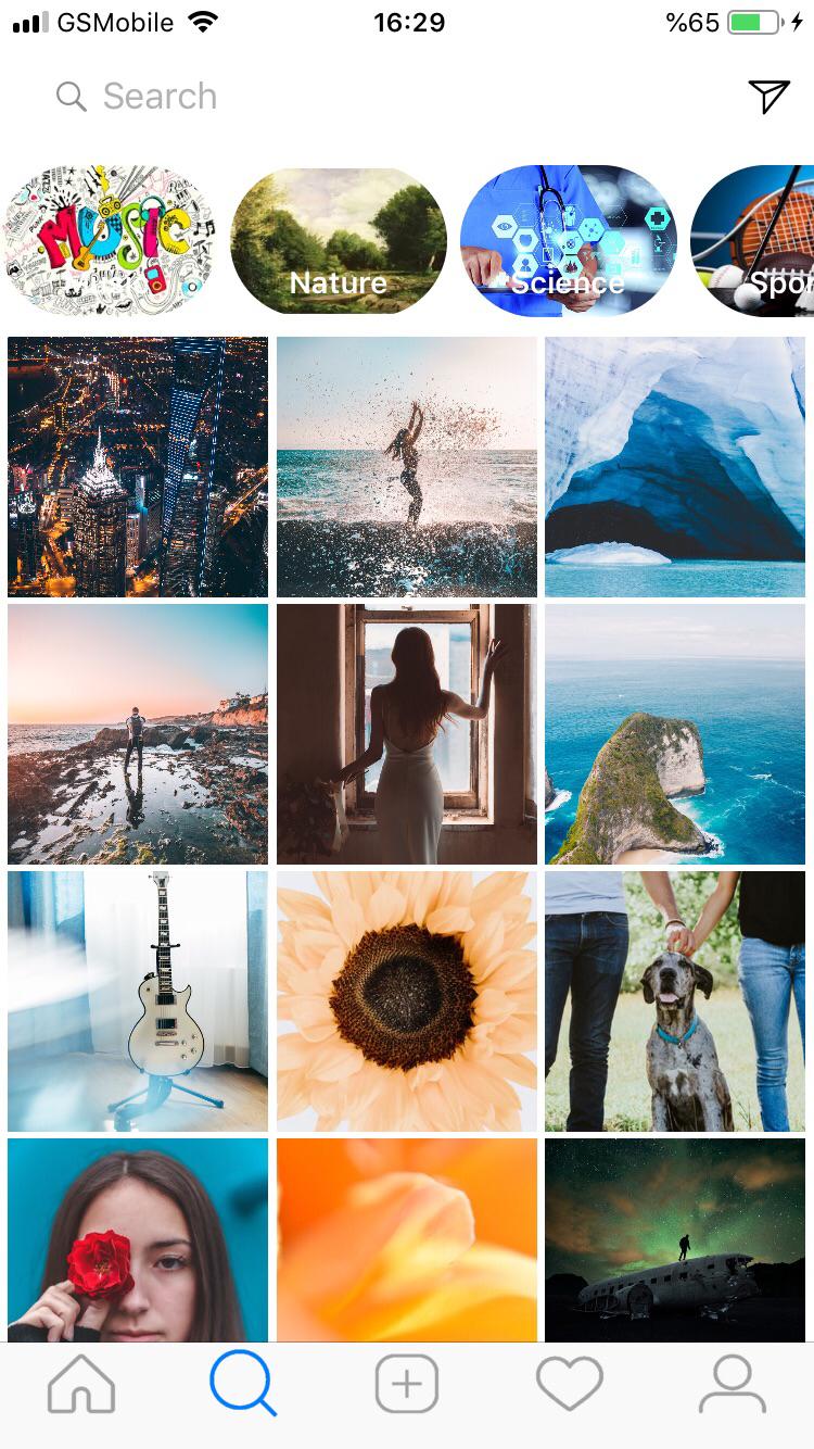
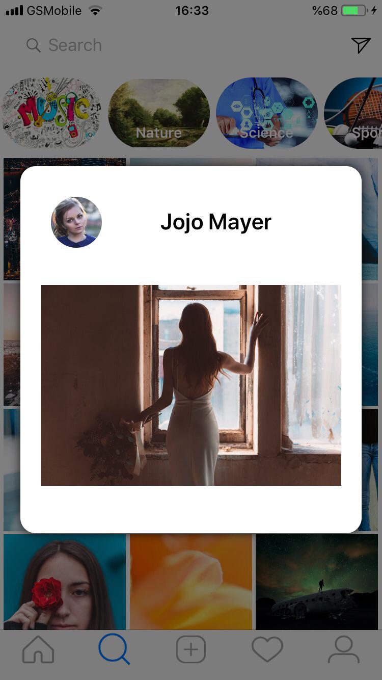
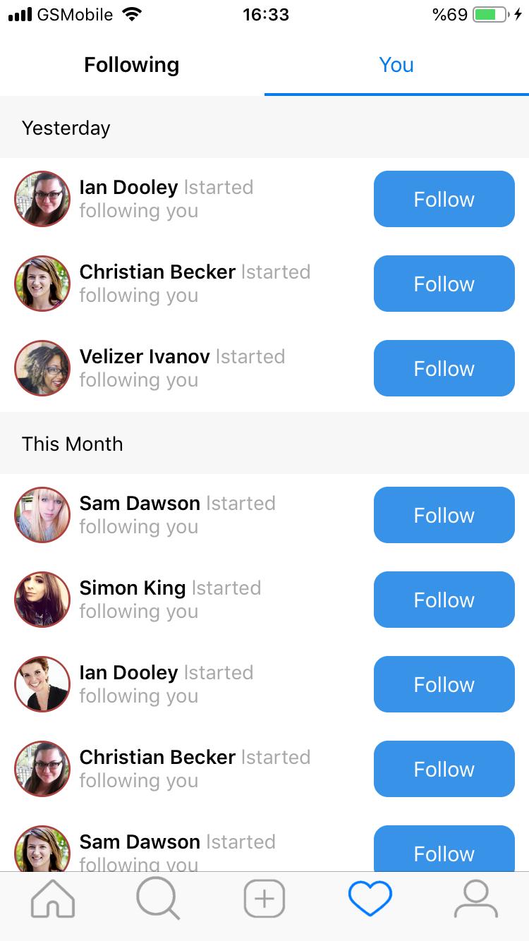


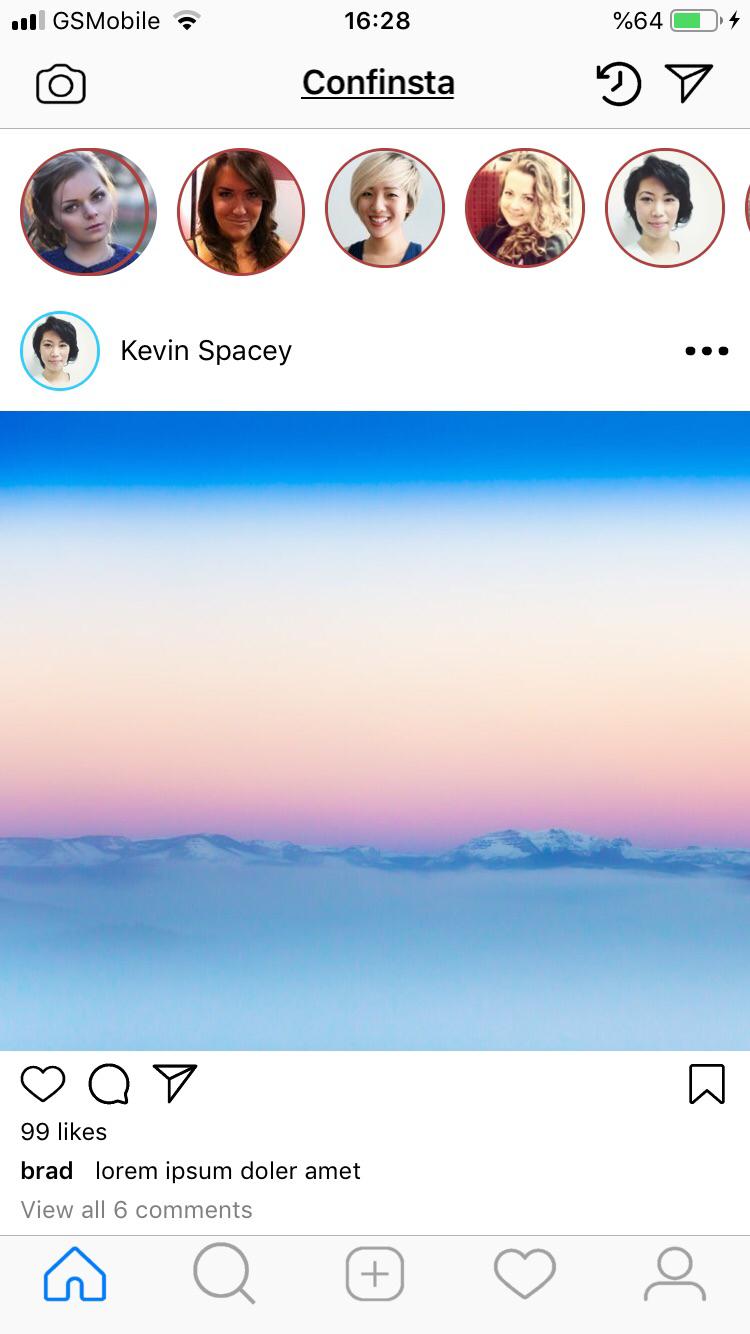
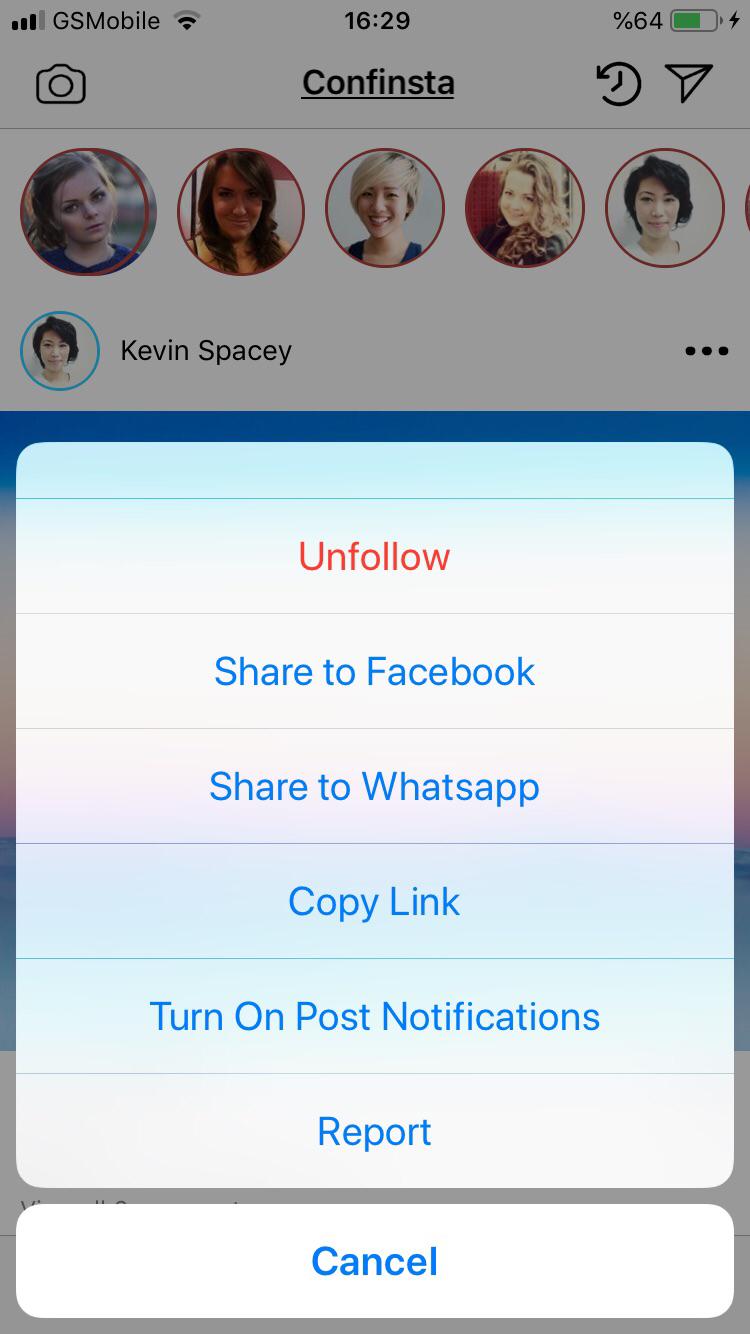
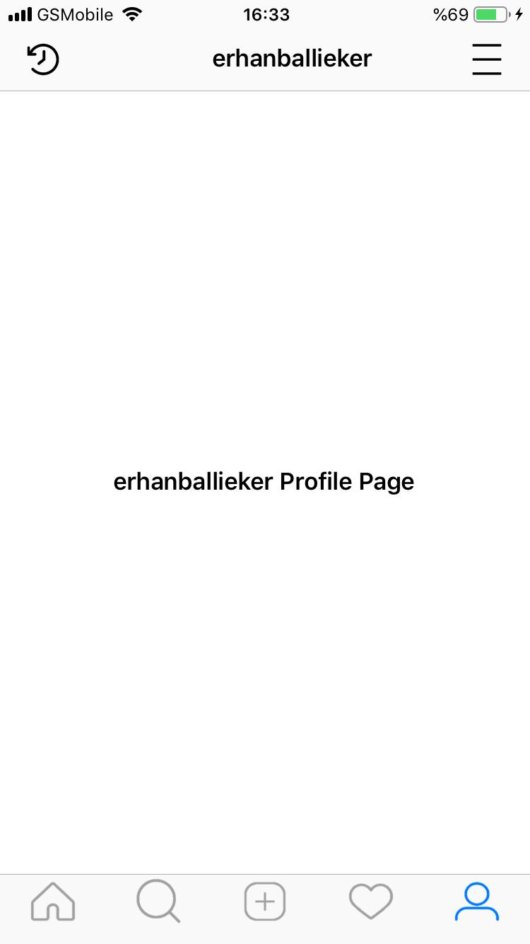
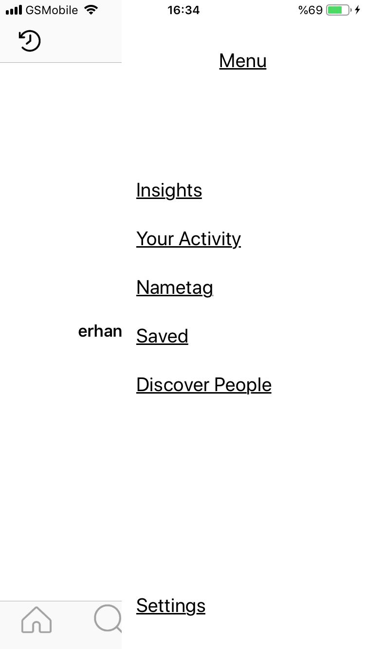
Tüm resimlerin yanında yukarı birde uygulamanın akışını görebilmeniz için kısa bir video koydum. Unutmayın yalnızca 1 iş günü ayrılmış bu ekran prototipleri bence gayet güzel gözüküyor. Xamarin.Forms ile yapabileceklerinizin gücünü anlamamız için yeterli bence.
Bir sonraki yazımda her bir sayfanın kod taraflarında detaylarına girip, hem xamarin in yeni özelliklerini göreceğiz hem de varolan özelliklerinden nasıl faydalanmışız bunlara bakacağız.
Görüşmek üzere.
 Erhan Ballıeker