Selamlar,
Son bir kaç yazıdır Xamarin.Forms ile geliştirdiğimiz kelime oyunun dan ve kullandığımız teknolojilerden bahsetmiştim.Şimdi de oyun ekranından bahsetmek üzere karşınızdayım.
Burada oyun componenti için custom renderer yazarken nelerle karşılaştık ne şekilde aştık bunlardan bahsetmek istiyorum.
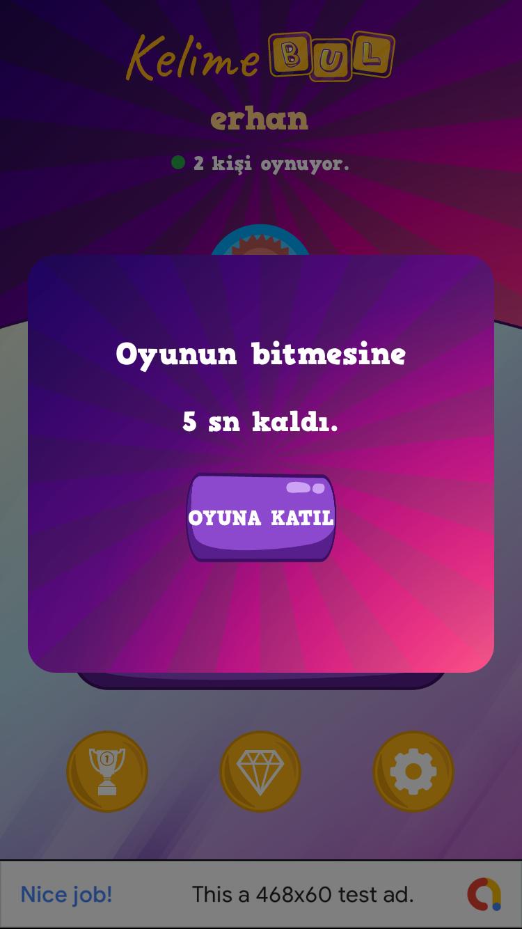
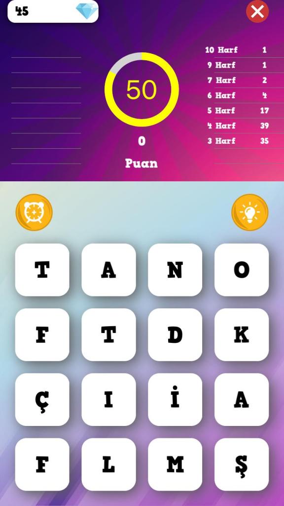
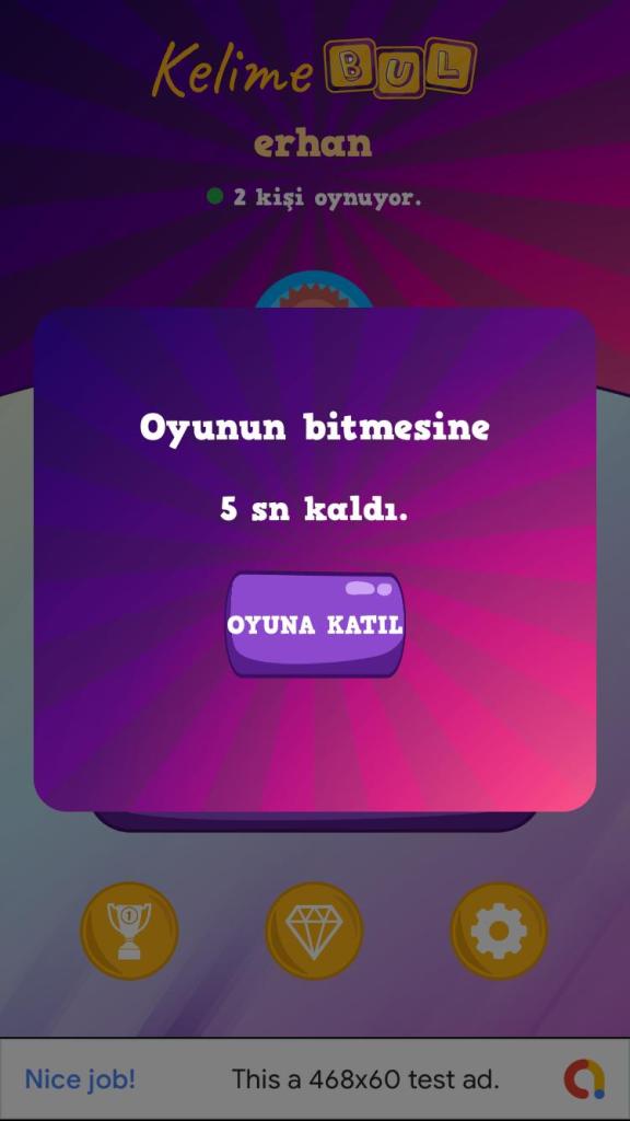
Önce oyun ekranını bir hatırlayalım

Burada iki adet custom component mevcut.
- Custom Circle Progress Bar (Zaman geri sayacı olarak kullandığımız)
- Custom Grid
Önce Circle ProgressBar dan bahsedeyim.
public class CircleProgressBar : BoxView
    {
        public readonly BindableProperty BackColorProperty = BindableProperty.Create(nameof(BackColor), typeof(Color), typeof(CircleProgressBar), Color.Transparent);
        public readonly BindableProperty ForeColorProperty = BindableProperty.Create(nameof(ForeColor), typeof(Color), typeof(CircleProgressBar), Color.Transparent);
        public readonly BindableProperty BarHeightProperty = BindableProperty.Create(nameof(BarHeight), typeof(double), typeof(CircleProgressBar), default(double));
        public readonly BindableProperty MinimunProperty = BindableProperty.Create(nameof(Minimun), typeof(int), typeof(CircleProgressBar), default(int));
        public readonly BindableProperty MaximunProperty = BindableProperty.Create(nameof(Maximun), typeof(int), typeof(CircleProgressBar), default(int),propertyChanged: (b, o, n) =>
        {
            var bar = (CircleProgressBar)b;
            bar.Maximun = (int)n;
        });
        public readonly BindableProperty ValueProperty = BindableProperty.Create(nameof(Value), typeof(int), typeof(CircleProgressBar), default(int),
            BindingMode.TwoWay,
               (BindableProperty.ValidateValueDelegate)null,
               (obj, oldValue, newValue) => {
                   var bar = obj as CircleProgressBar;
                   if (bar.BindingContext is MainPageViewModel context)
                   {
                       bar.Value = context.RemainingTime;
                   }
               },
               (BindableProperty.BindingPropertyChangingDelegate)null,
               (BindableProperty.CoerceValueDelegate)null,
               (BindableProperty.CreateDefaultValueDelegate)null);

        public readonly BindableProperty AnimationDurationProperty = BindableProperty.Create(nameof(AnimationDuration), typeof(int), typeof(CircleProgressBar), default(int));
        public readonly BindableProperty TextSizeProperty = BindableProperty.Create(nameof(TextSize), typeof(int), typeof(CircleProgressBar), default(int));
        public readonly BindableProperty TextMarginProperty = BindableProperty.Create(nameof(TextMargin), typeof(int), typeof(CircleProgressBar), default(int));
        public readonly BindableProperty TextProperty = BindableProperty.Create(nameof(Text), typeof(string), typeof(CircleProgressBar), string.Empty, propertyChanged: (b, o, n) =>
        {
            var bar = (CircleProgressBar)b;
            if (bar.BindingContext is MainPageViewModel context)
            {
                bar.Text = context.RemainingTime.ToString();
            }
        });
        public readonly BindableProperty TextColorProperty = BindableProperty.Create(nameof(TextColor), typeof(Color), typeof(CircleProgressBar), Color.Black);

        public CircleProgressBar()
        {
        }

        public Color BackColor
        {
            get { return (Color)GetValue(BackColorProperty); }
            set { SetValue(BackColorProperty, value); }
        }

        public Color ForeColor
        {
            get { return (Color)GetValue(ForeColorProperty); }
            set { SetValue(ForeColorProperty, value); }
        }

        public double BarHeight
        {
            get { return (double)GetValue(BarHeightProperty); }
            set { SetValue(BarHeightProperty, value); }
        }

        public int Minimun
        {
            get { return (int)GetValue(MinimunProperty); }
            set { SetValue(MinimunProperty, value); }
        }

        public int Maximun
        {
            get { return (int)GetValue(MaximunProperty); }
            set { SetValue(MaximunProperty, value); }
        }

        public int Value
        {
            get { return (int)GetValue(ValueProperty); }
            set { SetValue(ValueProperty, value); }
        }

        public int AnimationDuration
        {
            get { return (int)GetValue(AnimationDurationProperty); }
            set { SetValue(AnimationDurationProperty, value); }
        }

        public int TextSize
        {
            get { return (int)GetValue(TextSizeProperty); }
            set { SetValue(TextSizeProperty, value); }
        }

        public int TextMargin
        {
            get { return (int)GetValue(TextMarginProperty); }
            set { SetValue(TextMarginProperty, value); }
        }

        public string Text
        {
            get { return GetValue(TextProperty).ToString(); }
            set { SetValue(TextProperty, value); }
        }

        public Color TextColor
        {
            get { return (Color)GetValue(TextColorProperty); }
            set { SetValue(TextColorProperty, value); }
        }
    }
Burada göreceğiniz gibi aslında circular progress bar oluşturmak için BoxView dan miras aldık. Gerekli bir kaç property i bindable olarak tanımladıktan sonra platforms spesifik taraflara geçip Custom Renderer larımızı yazmaya başladık
Aşağıda iOS Custom Renderer kodlarını görüyorsunuz.
BoxView ios tarafından temel de UIView kullandığı için ister BoxRenderer dan isterseniz VisualElementRenderer dan miras alarak custom renderer a başlayabilirsiniz.BoxRenderer da en nihayetinde VisualElementRenderer dan miras alıyor zaten.
[assembly: ExportRenderer(typeof(CircleProgressBar), typeof(CircleProgressBarRenderer))]
namespace...iOS.CustomRenderers
{
    public class CircleProgressBarRenderer : VisualElementRenderer
    {
        CAShapeLayer backgroundCircle;
        CAShapeLayer indicatorCircle;
        UILabel indicatorLabel;
        CGSize indicatorLabelSize;
        int indicatorFontSize;

        double startAngle = 1.5 * Math.PI;

        public CircleProgressBarRenderer()  { }

        protected override void OnElementChanged(ElementChangedEventArgs e)
        {
            base.OnElementChanged(e);

            if (Element != null)
            {
                indicatorFontSize = Element.TextSize;

                backgroundCircle = new CAShapeLayer();

                CreateBackgroundCircle();

                CreateIndicatorCircle();

                CreateIndicatorLabel();
            }
        }

        protected override void OnElementPropertyChanged(object sender, PropertyChangedEventArgs e)
        {
            base.OnElementPropertyChanged(sender, e);

            if (e.PropertyName == "Text")
            {
                if (Element.BindingContext is MainPageViewModel model)
                {
                    indicatorLabel.Text = model.RemainingTime.ToString();
                    var val = CalculateValue();
                    animateBackwards(val);
                }
            }
        }

        public override void LayoutSubviews()
        {
            base.LayoutSubviews();

            double radius = CreatePathAndReturnRadius();

            double heightRatio = (radius - Element.TextMargin) / indicatorLabelSize.Height;
            double widthRatio = (radius - Element.TextMargin) / indicatorLabelSize.Width;
            double ratio = 1;
            if (heightRatio < widthRatio)                                   ratio = (radius - Element.TextMargin) / indicatorLabelSize.Height;             else                 ratio = (radius - Element.TextMargin) / indicatorLabelSize.Width;             indicatorFontSize = (int)Math.Round(indicatorFontSize * ratio, 0, MidpointRounding.ToEven);             indicatorLabel.Font = UIFont.SystemFontOfSize(indicatorFontSize);             indicatorLabel.InvalidateIntrinsicContentSize();             indicatorLabelSize = indicatorLabel.IntrinsicContentSize;             indicatorLabel.Frame = new CGRect((Frame.Width / 2) - (indicatorLabelSize.Width / 2), (Frame.Height / 2) - (indicatorLabelSize.Height / 2), indicatorLabelSize.Width, indicatorLabelSize.Height);             this.AddSubview(indicatorLabel);             animate();         }         private double CalculateValue()         {             double min = Element.Minimun;             double max = Element.Maximun;             double current = Element.Value;             double range = max - min;             return current / range > 1 ? 1 : current / range;
        }

        private void CreateIndicatorLabel()
        {
            indicatorLabel = new UILabel();
            indicatorLabel.AdjustsFontSizeToFitWidth = true;
            indicatorLabel.Font = UIFont.SystemFontOfSize(indicatorFontSize);
            indicatorLabel.Text = Element.Text.ToString();
            indicatorLabel.TextColor = Element.TextColor.ToUIColor();
            indicatorLabel.TextAlignment = UITextAlignment.Center;
            indicatorLabelSize = indicatorLabel.IntrinsicContentSize;
        }

        private void CreateIndicatorCircle()
        {
            indicatorCircle = new CAShapeLayer();
            indicatorCircle.StrokeColor = Element.ForeColor.ToCGColor();
            indicatorCircle.FillColor = UIColor.Clear.CGColor;
            indicatorCircle.LineWidth = new nfloat(Element.BarHeight);
            indicatorCircle.Frame = this.Bounds;
            indicatorCircle.LineCap = CAShapeLayer.CapButt;
            this.Layer.AddSublayer(indicatorCircle);
        }

        private void CreateBackgroundCircle()
        {
            backgroundCircle.StrokeColor = Element.BackColor.ToCGColor();
            backgroundCircle.FillColor = UIColor.Clear.CGColor;
            backgroundCircle.LineWidth = new nfloat(Element.BarHeight);
            backgroundCircle.Frame = this.Bounds;
            this.Layer.AddSublayer(backgroundCircle);
        }

        private double CreatePathAndReturnRadius()
        {
            var radius = (Math.Min(Frame.Size.Width, Frame.Size.Height) - backgroundCircle.LineWidth - 2) / 2;
            var circlePath = new UIBezierPath();
            circlePath.AddArc(new CGPoint(Frame.Size.Width / 2, Frame.Size.Height / 2), (nfloat)radius, (nfloat)startAngle, (nfloat)(startAngle + 2 * Math.PI), true);
            backgroundCircle.Path = circlePath.CGPath;
            indicatorCircle.Path = circlePath.CGPath;
            backgroundCircle.StrokeEnd = new nfloat(1.5);
            indicatorCircle.StrokeEnd = new nfloat(1.5);//new nfloat(CalculateValue());
            return radius;
        }

        private void animate()
        {
            var animation = new CABasicAnimation();
            animation.KeyPath = "strokeEnd";
            animation.Duration = Element.AnimationDuration / 1000;
            animation.From = new NSNumber(0.0);
            animation.To = new NSNumber(CalculateValue());
            animation.TimingFunction = CAMediaTimingFunction.FromName(CAMediaTimingFunction.EaseOut);
            indicatorCircle.StrokeStart = new nfloat(0.0);
            indicatorCircle.StrokeEnd = new nfloat(CalculateValue());
            indicatorCircle.AddAnimation(animation, "appear");
        }

        private void animateBackwards(double val)
        {
            var animation = new CABasicAnimation();
            animation.KeyPath = "strokeEnd";
            animation.Duration = Element.AnimationDuration / 1000;
            animation.From = new NSNumber(val);
            animation.To = new NSNumber(val - 0.00185);
            animation.TimingFunction = CAMediaTimingFunction.FromName(CAMediaTimingFunction.EaseOut);
            indicatorCircle.StrokeStart = new nfloat(0.0);
            indicatorCircle.StrokeEnd = new nfloat(1.5);
            indicatorCircle.AddAnimation(animation, "appear");
        }
    }
}
iOS tarafında CAShapeLayer sınıfı ekranda birşeyler çizmek için kullanacak olduğunuz namespace.
Biz de ekran xamarin forms tarafında renk, font size vs gibi bazı propertyleri alarak, bir yuvarlak simit oluşturuyoruz. Tam ortasına denk gelecek şekilde hesaplayarak bir adet UILabel i simitin ortasına yerleştiriyoruz.
Sonrasında iki farklı animasyon olarak, birincisi ekran ilk açıldığında sıfırdan maksimum noktasına gelecek şekilde animate edip, daha sonra her bir saniye geçtiğinde çizilmesi gereken kısmı hesaplayıp ters yönde bir animasyon çalıştırıyoruz.
OnElementPropertyChanged olayında da hem UILabel ın text ini hem de geri şekilde yapılacak olan anismayonumuzu oynatıyoruz. OnElementPropertyChanged olayı bildiğiniz gibi bir custom renderer yazarken, forms tarafında oluşturmuş olduğunuz bindable propertylerın değerlerinin değişmesi sonucu platform spesifik taraflarda bu olayı tetikliyor. Dolayısı ile bir custom renderer yazdığınız zaman, oluşturmuş olduğunuz componentin bazı değerleri runtime içerisinde değişiyor ve buna göre aksiyonlar almanız gerekiyorsa bu event içerisinde ilgili aksiyonlarınızı tetikleyebilirsiniz.
Android tarafında da durum şöyle.
[assembly: ExportRenderer(typeof(CircleProgressBar), typeof(CircleProgressBarRenderer))]

namespace ...Droid.CustomRenderers
{
    public class CircleProgressBarRenderer : ViewRenderer<CircleProgressBar, ProgressBar>
    {
        private ProgressBar pBar;
        private Drawable pBarBackDrawable;
        private Drawable pBarForeDrawable;
        public CircleProgressBarRenderer(Context context) : base(context)
        {
            SetWillNotDraw(false);
        }

        protected override void OnElementChanged(ElementChangedEventArgs e)
        {
            base.OnElementChanged(e);
            if (Control == null)
            {
                pBar = CreateNativeControl();
                SetNativeControl(pBar);
                CreateAnimation();
            }
        }

        protected override void OnElementPropertyChanged(object sender, PropertyChangedEventArgs e)
        {
            base.OnElementPropertyChanged(sender, e);

            if (e.PropertyName == "Text")
            {
                if (Element.BindingContext is MainPageViewModel model)
                {
                    CreateAnimationCountDown(model.RemainingTime);
                    Draw(new Canvas());
                }
            }
        }

        protected override ProgressBar CreateNativeControl()
        {
            pBarBackDrawable = DrawableCompat.Wrap(Resources.GetDrawable("CircularProgress_background"));
            pBarForeDrawable = DrawableCompat.Wrap(Resources.GetDrawable("CircularProgress_drawable"));

            DrawableCompat.SetTint(pBarBackDrawable, Element.BackColor.ToAndroid());
            DrawableCompat.SetTint(pBarForeDrawable, Element.ForeColor.ToAndroid());

            var nativeControl = new ProgressBar(Context, null, Android.Resource.Attribute.ProgressBarStyleHorizontal)
            {
                Indeterminate = false,
                Max = Element.Maximun,
                ProgressDrawable = pBarForeDrawable,
                Rotation = -90f,
                LayoutParameters = new LayoutParams(LayoutParams.MatchParent, LayoutParams.MatchParent),
            };

            nativeControl.SetBackground(pBarBackDrawable);

            return nativeControl;
        }

        public override void Draw(Canvas canvas)
        {
            base.Draw(canvas);
        }

        protected override void OnDraw(Canvas canvas)
        {
            base.Invalidate();
            base.OnDraw(canvas);

            Rect bounds = new Rect();
            TextPaint paint = new TextPaint();
            paint.Color = Element.TextColor.ToAndroid();
            paint.TextSize = Element.TextSize;
            paint.GetTextBounds(Element.Text.ToString(), 0, Element.Text.ToString().Length, bounds);
            if (((this.Width / 2) - (Element.TextMargin * 4)) < bounds.Width())
            {
                float ratio = (float)((this.Width / 2) - Element.TextMargin * 4) / (float)bounds.Width();
                paint.TextSize = paint.TextSize * ratio;
                paint.GetTextBounds(Element.Text.ToString(), 0, Element.Text.ToString().Length, bounds);
            }

            int x = this.Width / 2 - bounds.CenterX();
            int y = this.Height / 2 - bounds.CenterY();
            canvas.DrawText(Element.Text.ToString(), x, y, paint);
        }

        private void CreateAnimation()
        {
            ObjectAnimator anim = ObjectAnimator.OfInt(pBar, "progress", Element.Minimun, Element.Value);
            anim.SetDuration(Element.AnimationDuration);
            anim.SetInterpolator(new DecelerateInterpolator());
            anim.Start();
        }

        private void CreateAnimationCountDown(int val)
        {
            ObjectAnimator anim = ObjectAnimator.OfInt(pBar, "progress", val, val - 1);
            anim.SetDuration(Element.AnimationDuration);
            anim.SetInterpolator(new DecelerateInterpolator());
            anim.Start();
        }
    }
}
Android tarafında ise işler kısmen daha kolay çünkü zaten bir ProgressBar widget ı var. Bu tarafta ise bu widget ın ortasına Text i basmak biraz zor oldu, OnDraw metodunu override edip tam ortaya gelecek şekilde bir canvas çizerek devam ettik.
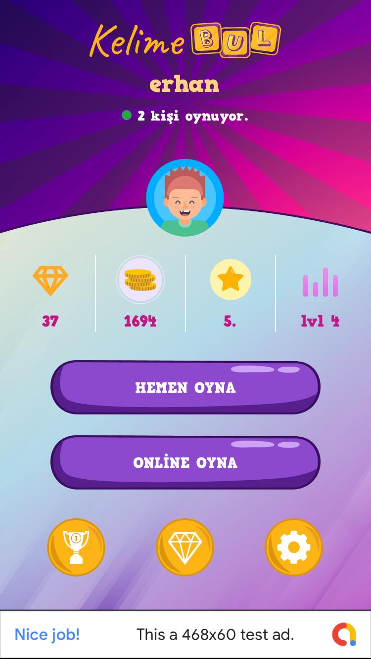
Nihayetinde yukarıdaki resimde ki gibi, renkleri gibi bazı özellikleri ile oynayabildiğimiz ileri geri animasyonla hareke edebilen, güzel bir circle progress bar ımız olmuş oldu her iki platformda da.
Gelelim Grid View ın kendisine. Burada en çok dikkat çeken şey benim için şu oldu.
xamarin.forms.platform.ios içerisinde ki GetControl metodu ve bu metodun android tarafında olmayışı.
Çünkü ilerleyişe şu şekilde başladık;
- Xamarin.Forms tarafında normal Grid den miras alan bir component yazıp, istediğimiz ekstra özellikleri buraya ekleyelim
- Zaten harf dizilimlerini de burada yaptıktan sonra, Platform spesifik taraflara geçerek, Touch eventleri ezip ilgili harf e denk gelen o touch ile ilgili işlemlerimizi yapalım
Bu işleyiş iOS tarafında çok güzel çalıştı. Forms tarafında yaptığımız CustomGrid, içi dolu bir şekilde iOS tarafında GetControl dediğimizde elimizdeydi. Ekrandaki tüm UIView lar içerisinde dönüp istediğimiz işlemi istediğimiz şekilde yapabildik. Her şey çok güzeldi.
taa ki android tarafında ki renderer kısmına geçene kadar.
İki taraftada ViewRenderer kullanmamıza rağmen, Android tarafta nereden miras alırsak alalım, elimize Forms tarafında içini butonlarla doldurduğumuz halde bir grid gelmedi. Bir şekilde her ne denediysek, forms taraftaki içi dolu Grid e ulaşamadık.
Bu yüzden tüm GridView baştan oluşturup ekrana sıfırdan bir komponent yazıyormuş eklemek zorunda kaldık.
GridView ın forms tarafı şu şekilde.
 public class CustomGrid : Grid
    {
        public CustomGrid()
        {
            SwipedButtonList = new List();
        }

        public List SwipedButtonList { get; set; }

        public static readonly BindableProperty IsFilledProperty = BindableProperty.Create(nameof(IsFilled),
           typeof(bool),
           typeof(CustomGrid),
           false,
           BindingMode.TwoWay,
           null,
           null,
           null,
           null,
           null);


        public bool IsFilled
        {
            get { return (bool)this.GetValue(IsFilledProperty); }
            set { this.SetValue(IsFilledProperty, (object)value); }
        }


        public static readonly BindableProperty SelectWordProperty = BindableProperty.Create(nameof(BackgroundColor),
               typeof(string),
               typeof(CustomGrid),
               string.Empty,
               BindingMode.TwoWay,
               null,
               (obj, oldValue, newValue) => {
                   var old = oldValue;
                   var n = newValue;
                   var grid = obj as CustomGrid;

                   (grid.BindingContext as MainPageViewModel).SelectedWord = n.ToString();
               },
               null,
               null,
               null);


        public string SelectedWord
        {
            get { return (string)this.GetValue(SelectWordProperty); }
            set { this.SetValue(SelectWordProperty, (object)value); }
        }
    }
iOS tarafındaki CustomRenderer;
public class CustomGridRenderer : ViewRenderer
    {
        UIView myGrid;
        List selectedButtonList = new List();

        protected override void OnElementChanged(ElementChangedEventArgs e)
        {
            base.OnElementChanged(e);

            if (Control != null)
            {
                Control.BackgroundColor = UIColor.White;
            }
            else
            {
                myGrid = GetControl();

                if (myGrid != null)
                {
                    foreach (UIView sview in myGrid.Subviews)
                    {
                        var ctrl = (sview as ButtonRenderer).Control;
                        if (ctrl != null)
                        {
                            ctrl.UserInteractionEnabled = false;
                        }
                    }
                }
            }
        }

        protected override void OnElementPropertyChanged(object sender, PropertyChangedEventArgs e)
        {
            base.OnElementPropertyChanged(sender, e);

            if (Control != null)
            {
                Control.BackgroundColor = UIColor.White;
            }
            else
            {
                myGrid = GetControl();

               ...
                }
            }
        }

        public override void TouchesBegan(NSSet touches, UIEvent evt)
        {
            base.TouchesBegan(touches, evt);
        }

        public override void TouchesMoved(NSSet touches, UIEvent evt)
        {
            base.TouchesMoved(touches, evt);
            var grid = Element as CustomGrid;
            int totalSwipedButtonCount = grid.SwipedButtonList.Count;

           for (int i = 0; i < myGrid.Subviews.Length; i++)
           {
             foreach (UITouch touch in touches)
                {
                   var ctrl = (myGrid.Subviews[i] as ButtonRenderer).Control;
                    if (ctrl.PointInside(touch.LocationInView(ctrl), evt) && !(ctrl.AccessibilityValue == "blue"))
                    {
                       ...
                    }
                    else if (ctrl.PointInside(touch.LocationInView(ctrl), evt))
                    {
                       ...
                    }
                }
            }
        }

        public override async void TouchesEnded(NSSet touches, UIEvent evt)
        {
            base.TouchesEnded(touches, evt);

            var grid = Element as CustomGrid;
            var context = Element.BindingContext as MainPageViewModel;

            var foundWord = context.Words.FirstOrDefault(x => x.Word == grid.SelectedWord);

            if (Element != null)
            {
                if (Element is CustomGrid _grid)
                {
                   ...
                }
            }

            ...

        }
    }
Buradaki çok gerekli olmayan kodları kaldırdım, zira en önemli nokta yukarıda da kalın olarak işaretlediğim gibi, o anki touch noktasının Grid içerisinde ki hangi butona denk geldiğini bulmak oldu sadece.
Bunu da
var ctrl = (myGrid.Subviews[i] as ButtonRenderer).Control;
if (ctrl.PointInside(touch.LocationInView(ctrl), evt) && !(ctrl.AccessibilityValue == “blue”)) { …. }
control üzerindeki PointInside metodunu ve touch dan gelen LocationInView metodu nın birlikte kullanımı ile çok basit bir şekilde yapabiliyorsunuz.
Yani sizde içerisinde birden çok ui element i olan ve parmak ile gezildikçe o anki element üzerinde bir şey yapmanız gerekirse iOS tarafında, özet işleyiş şu şekilde oluyor;
TouchesMoved eventi içerisinde tüm UIView larda gezerken yukarıdaki iki metodu kullanarak bu işi hallediyorsunuz.
Gelelim Android tarafına. Yukarıda bahsetiğim gibi android tarafında sıfırdan bir GridView oluşturup, kendi Adapter i ile içerisini doldurup, onun üzerinden yürüdük.
iOS dan farklı olarak burada ayrı ayrı gelen touch eventleri yerine tek bir DispatchTouchEvent event i mevcut. Buraya geçilen MotionEvent ile o anki motion ı yakalayıp işlemlerinizi istediğiniz hareket altında yazabilirsiniz.
        GridView mainView;


        public CustomGridRenderer(Context context)
            : base(context)
        {

        }

        protected override void OnElementPropertyChanged(object sender, PropertyChangedEventArgs e)
        {
            base.OnElementPropertyChanged(sender, e);

            if (Control != null)
            {
                var count = Control;
            }

            if (e.PropertyName == "IsFilled")
            {
                var linearLayout = new LinearLayout(Context);
                linearLayout.LayoutParameters = new LayoutParams(100, 100)
                {
                    Width = LayoutParams.MatchParent,
                    Height = LayoutParams.MatchParent
                };

                var density = Resources.DisplayMetrics.Density;

                mainView = new GridView(Context);
                mainView.SetNumColumns(4);
                mainView.SetHorizontalSpacing((int)(10 * density));
                mainView.SetVerticalSpacing((int)(10 * density));

                var adapter = new ButtonAdapter(Context);
                foreach (var item in Element.Children)
                {
                    //add buttons to grid.
                    var customButton = item as CustomButton;
                    adapter.CustomButtons.Add(customButton);
                    var btn = new Button(Context)
                    {
                        Text = customButton.Text,
                        Tag = customButton.WordIndex,
                        TextSize = 30,
                        Clickable = false
                    };

                    Typeface tf = Typeface.CreateFromAsset(Context.Assets, "HVD_Comic_Serif_Pro.ttf");
                    btn.SetTypeface(tf, TypefaceStyle.Normal);

                    btn.LayoutParameters = new LayoutParams(30, 30)
                    {
                        Width = LayoutParams.MatchParent,
                        Height = LayoutParams.MatchParent
                    };
                    btn.SetHeight(60);
                    btn.SetBackgroundResource(Resource.Drawable.Button_Border);
                    btn.SetTextColor(Android.Graphics.Color.Black);
                    adapter.Buttons.Add(btn);

                  ...
                }

                adapter.SecreenDensity = density;
                adapter.FormsGrid = Element;
                mainView.Adapter = adapter;
                linearLayout.AddView(mainView);

                SetNativeControl(linearLayout);
            }
        }

        public override bool DispatchTouchEvent(MotionEvent e)
        {
            var grid = Element as CustomGrid;
            int totalSwipedButtonCount = grid.SwipedButtonList.Count;
            var insideGrid = Control.GetChildAt(0) as GridView;

            switch (e.Action)
            {
                case MotionEventActions.Up:

                     ...
                    break;
                case MotionEventActions.Move:
                    int x = (int)Math.Round(e.GetX());
                    int y = (int)Math.Round(e.GetY());

                    for (int i = 0; i < insideGrid.ChildCount; i++)
                     {
                       var child = insideGrid.GetChildAt(i) as Button;
                         if (child != null)
                             {

                             if (x > child.Left && x < child.Right && y > child.Top && y < child.Bottom && child.ContentDescription != "done")

                                   ...
                        }
                    }

                    break;
                default:
                    break;
            }

            return base.DispatchTouchEvent(e);
        }

        public class ButtonAdapter : BaseAdapter
        {

          ...
        }
    }
Burada da önce bir LinearLayout oluşturuyoruz. Bunun içerisine bir GridView atıyoruz. Bu Grid in içerisini de butonlarla dolduruyoruz.
iOS tarafında yaptığımız gibi ilgili touch ın hangi ui elemente denk geldiğini bulmak içinse bu tarafta şu şekilde ilerliyoruz.
for (int i = 0; i < insideGrid.ChildCount; i++) {
var child = insideGrid.GetChildAt(i) as Button;
if (x > child.Left && x < child.Right && y > child.Top && y < child.Bottom …)
Grid içerisindeki tüm ChildCount sayısı kadar bir for döngüsü içerisinde dönüp, İçerisinde döndüğümüz grid in o anki “i” index li elemanını yakalayıp, bu elemanın Left-Right-Top-Bottom ı, touch ın x ve y değerleri içerisinde mi buna bakıyoruz.
Yani aslında iOS da bir iki metod ile yaptığımız işlemi burada daha gözler önünde yapıyoruz.
Bu yazımda da bahsetmek istediklerim bu kadar
Bir sonraki yazımda görüşmek üzere.


 Erhan Ballıeker